Website Design Trends 2024
If you’re looking to redesign your website, or even start a brand new website, it shouldn’t look like it was built in 2016. A contemporary design builds customer trust, and the features you employ can say a lot about your brand.
Whimsy, simplicity, and futuristic innovation can all be communicated through the design ideas and features that will be used on thousands of new websites this year.
Best Website Design Ideas in 2024
Designing websites is what we do, so we know when something good comes around. These ideas will make your site stand out and show off your brand.
How do I know if I need a new website?
Colourful Gradients
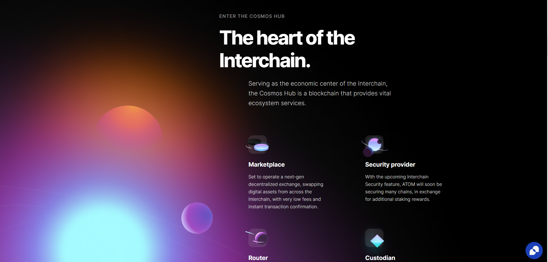
Rather than minimalist linear gradients, 2024 is about complex gradients that blend 3 or more colours. This creates depth and dynamic interest across the page and is perfect for brands where creativity is key.
A gradient like this can give sites a sense of space and light, even in dark mode, as this intergalactic example from Cosmos shows.
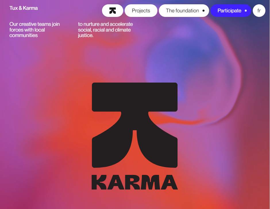
These creative colour gradients can also give website designs a psychedelic effect when combined with mouse interactions, as in is this award-winning design.
On this site, the user’s mouse sends liquid ripples through the header’s gradient. When highlighting text, the highlight itself is animated, fading from one colour to the next.
The downside of all this animation is, as stated above, the slow page speed, which indexes at 5.6s on Lighthouse. This could be caused by an array of complexities across the site, but we suspect the header is playing a role.
Dark Mode
With more and more apps adding Dark Mode in recent years, websites are following suit. In the early days of computing, we wanted to mimic the blank white page, or at least follow print with dark text on a lighter background.
Today, designers are more aware of blue light’s effects on sleep, computer use causing eye strain and conditions such as migraines and headaches. Dark mode is much more comfortable to read and provides a contemporary feel to any website design.
Dark-mode website design doesn’t just mean black backgrounds with white text. It can mean any colour palette where the text colour is lighter and brighter than the background. For example, this dark red palette from data science company Ventriloc. 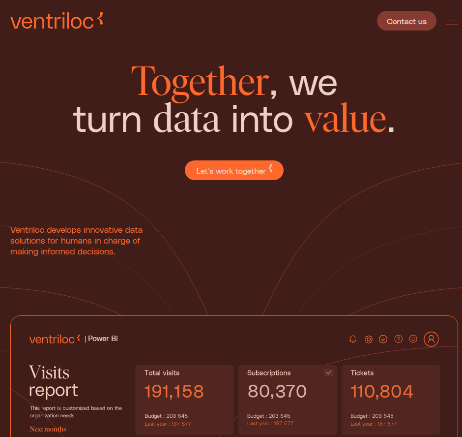
Grids, Outlines and Bento
Many new website designs are finding new aesthetics for their user interface. Instead of full-width sections, a grid helps designers show a lot of information without creating clutter.
Types of Grid Design:
- Informational: detailing features, USPs in neat, discrete sections
- Navigational: providing quick access to tools and service pages
- Aesthetic: communicating brand personality as organised, technical, and modern.
There are two different styles for these grids, however, with quite different effects.
Thin lines, flat colours and sharp edges
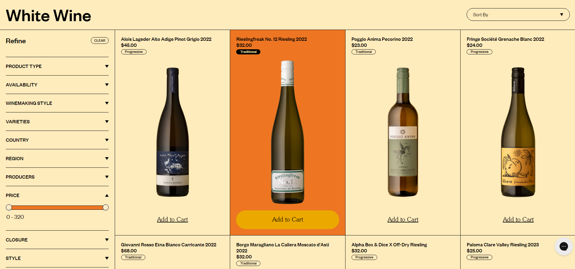
Some grids use thin, high-contrast borders to divide pages and menus. They often employ a low-impact colour palette and clean typography. This kind of design projects simplicity and a down-to-earth attitude, and is often used by companies working on sustainability and ethical business.
Curved Tiles on a Contrasting Background
The other side of the bento-grid coin is the designs that favour rounded tiles and complex colour palettes. They are much punchier and common in SaaS interfaces such as Pinterest and Spotify.
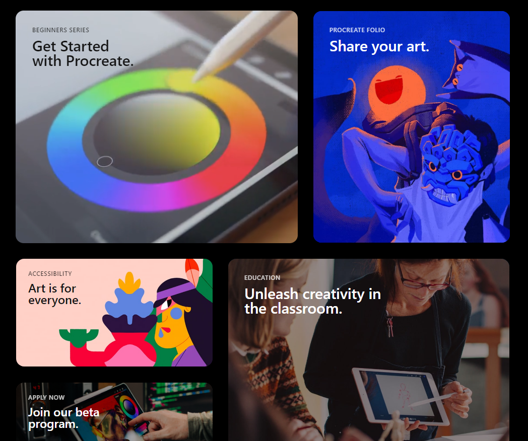
From Procreate.com
They are heavily used in Apple’s UX layouts and promotions, so wherever they appear they remind users of iPhones, app menus and the high-technology, futuristic atmosphere of the 2010s.
Amplify this futuristic appearance by adding shadows, gradients and dark mode designs.
If you’re interested in using a grid in your website design, make sure it matches your brand identity. Are you a back-to-basics, sustainable, salt-of-the-Earth company or a high-flying, hi-tech, streamlined business?
Custom Cursors
Custom cursors add novelty and whimsy to your digital branding. A cool new pizza restaurant could use a pizza slice cursor, for example. A dog-walking service could change the cursor into a chew toy.
This restaurant website design uses a peanut, chased by an elephant.
If it gels with your brand identity, this animation type can engage your ideal customers, turning your site into a game or a novelty. They spend more time on the site, looking for more fun features, and they develop an affinity for your brand.
They might even share your site just so their friends can see your cool cursor animation. All this makes them more likely to choose you when they’re ready to purchase.
A Hero’s Welcome: The Return of Static Hero Banners.
It’s goodbye to slideshow headers on homepages. These are fun when done well, but they can quickly grow too large, particularly with sub-optimal images. This slows the homepage down, with a negative effect on the whole design.
Slower site speeds mean potential customers navigate away, and search engines are less likely to rank the site on page 1.
Instead, 2024 will see a return to static hero banners. These high-definition banners fill the page right up to the fold. They’re responsive, having a great impact on desktop and mobile alike.
Hero Banners invite people to interact immediately and distil your branding into a focused message. This website design trend can do a lot for brands that prefer a focused user experience.
AI Design Features
AI has been the buzzword of digital circles for over a year now, and we are still seeing more use cases and innovations surfacing. While the basic Large Language Model content is nothing to write home about, the more advanced uses have us thinking.
Layout Generation
With machine learning, there are models like Hostinger that can create website layouts and templates, based on what most websites have already. It might not create anything ground-breaking, but it could give designers more time to focus on customisation and finer points.
Visual search
Using computer vision to recognise and identify certain objects, visual search functions have helped users identify plants, artists and landmarks, learning about the world through their phone camera.
In 2024, visual search will support eCommerce platforms by helping users find similar items for sale online. No more prying for where your friend got their trainers…
Dynamic Content Personalisation
By understanding how users interact with a site, AI can highlight content that may be most interesting to them. Just like Spotify’s playlist creation and recommendations, your website could create personalised wish-list suggestions, related products and blog recommendations.
Chat-bots
With AI content generators, customer service bots are likely to get an upgrade in 2024. They’ll be more able to write natural language, respond to technical commands and even walk users through payment processes. As long as your bot is equipped with the right API for your payment system, your website users will find making payments more accessible and satisfying.
Generative “Art”
AI has been making marketing imagery much quicker and cheaper for brands, and it looks like this will continue. AI art can mimic art media such as oil paints and charcoals, and styles such as cubism and pointillism.
We predict this will lead to a rise in complex imagery for some brands (where appropriate), as access to artistic images will no longer require artist and illustrator commissions.
**AI Pitfalls**
However, as fast and affordable as AI is making imagery, it is an imperfect solution. AI and generative art programmes frequently offer surreal additions to images, such as disembodied limbs or exaggerated facial expressions.
It also can never mimic true creativity. It is generative, not imaginative, and can only draw on what exists already.
For original art and thinking, brands will need to invest in human artists.
Kinetic Typography
Kinetic typography or dynamic typography is a feature that adds animation to text to create a whimsical and expressive home page feature. This is great as it can work as a loading animation, as in this zine from CashApp. It can also be triggered as a scroll animation, encouraging users to read to the end.
Accessible Website Design
In recent years, website designers have been paying more attention to accessibility for all. In part, this means enabling users that have disabilities, conditions or impairments which cause a barrier to internet use. Many people use assistive technology such as screen readers, magnifying software, closed captioning and eye trackers.
Accessible design takes proper coding to enable keyboard navigation, translation to audio or braille, or other enabling technologies. Make sure to include:
- Breadcrumbs to allow users to jump back up the page hierarchy
- Alt Text that describes the image accurately
- High colour contrast (above 4.5:1) to support users with low vision, colour blindness or migraine
- Descriptive link anchor text, not just “click here”.
- Semantic HTML such as heading, navigation and button tags to help assistive tech replicate the structure.
- ARIA (Accessible Rich Internet Applications) for elements that don’t have semantic HTML tags
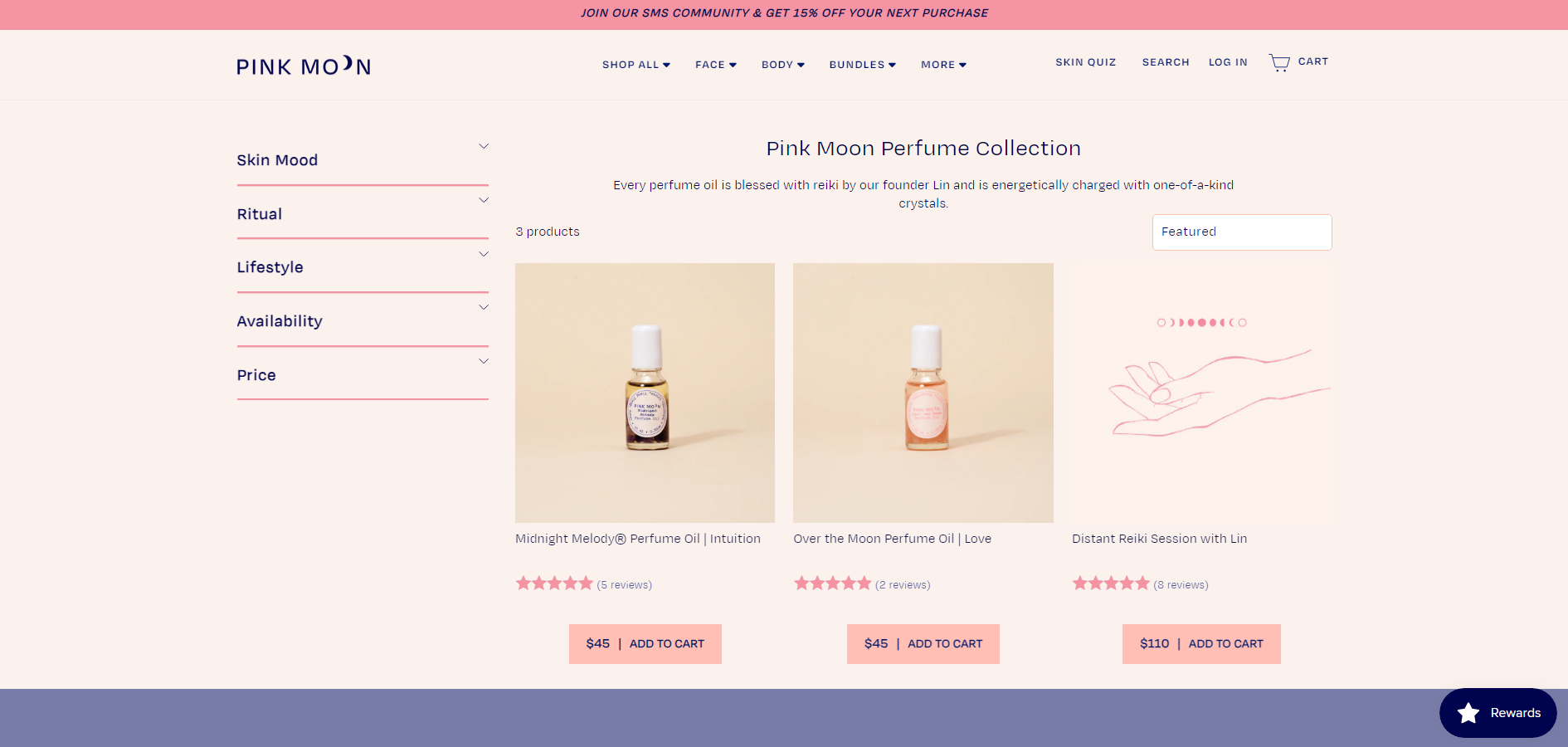
One great example of an e-commerce website that is beautiful and accessible is Pink Moon. This site has almost no contrast errors, it’s structured logically and uses semantic HTML and ARIA tags throughout.
Build it Well with eSterling
“As always, it’s contextual: You can look up some beautiful modern design techniques, but when you actually describe what they are, it’s similar to what we’ve always been doing, with a new twist. The way you use these design concepts is what makes a website look modern.”
Joel Birkett, Designer at eSterling Ltd.
There are fluctuations in web design trends, and the key is to understand which will stand the test of time. Is AI another bubble? Will custom cursors drive conversions? We’re willing to experiment with you. A lot of what makes today’s websites look brand new is similar to what’s gone before; the big impact is thanks to quality design.
Smartening up your Website Window Dressing
The old adage ‘a picture paints a thousand words’ is particularly apt in the field of web design. In the fast-paced click on, click off world of the internet, your web site needs to have a certain something to attract and retain your customers’ attention.
As part of a successful web site build, we are often tasked with the sourcing of good, strong imagery. The use of photographs, line drawings and other visual design features can make the difference between a good site and a great site. The right imagery will help you to carry your message and to support your company branding much quicker than text (although that’s important too). Here are a few tips:
- Human beings are pre-programmed to look at the faces and bodies of other humans, and so if you want to connect to your customers you may need to look for images of people. Choose carefully, people like real-looking people and so perhaps that supermodel might not be quite the ticket.
- Striking colours within images will attract attention and may add more power to your site than coloured text or page backgrounds, but go for clear, strong images rather than fussy or busy ones.
- If you’re selling products MAKE SURE you have an image for EVERY PRODUCT. Missing or broken images create a really bad impression on the browser and if someone can’t see what you’re offering they are very unlikely to buy it.
- In the same vein, it is worth spending a little bit of money to have your products photographed professionally. Clear images are much more successful than blurry, old or dim ones.
- Make sure your images are cohesive. Decide on a style or a frame of reference and stick to it. Your eSterling design team will be able to help you with this. Tartan and leopard-skin may both be striking, but it’s unlikely that putting them together will do anything except give you a headache.
- Supplement your images with great text. The use of clever straplines alongside your images will double the effect. Make sure you use succinct and relevant straplines.
If you have any queries about freshening up your current web site or building a new one, please contact eSterling and we’d be pleased to help. Call us on 0121 766 8087 or email enquiries@esterling.co.uk
What pictures should I use on my website?
They say that ‘a picture tells a thousand words’ and if this is true, it’s crucial that you get the imagery on your website right. Potential customers will judge your business based on the photographs or graphics that they find on your website, so any images must be professionally presented and appropriate to your company.
It’s worth spending some time carefully editing the images that you use on your website, starting with the home page. This is the most likely entrance for potential customers and the images need to encourage them to stay on your site and convert to a paying customer.
Your homepage needs to be eye catching and include welcoming images that are relevant to your sector. Always make sure that your imagery suits your company ethos – whether your company is strictly corporate, or relaxed and friendly.
You don’t need to stick to the obvious when it comes to imagery. Photographs can be used to suggest the things that you offer, which is particularly important if you are selling a service or idea, rather than a product. For example, a company offering loans might show a picture of a happy couple with a new house, rather than documents or a pile of money. You can buy these types of lifestyle photos from picture libraries such as iStock.
Once a customer has been convinced that your message is relevant, they will hopefully move on to your products and services. If you have an e-commerce site, you need to make sure that product photos are well presented. If a customer can’t see your product because the photograph is blurred or too dark, it’s unlikely that they will have the confidence to buy it online. It’s therefore worth investing in professional product photography, or alternatively source images from your suppliers.
The about page is another place where you should consider placing images. This gives a personal view of your company and is a space where you can introduce yourself and your team. Head shots or a group photo are perfect for this. You could also consider adding a photo of your premises.
At every stage, the quality of the images you use should be your top priority. Pixellated, distorted, dark or blurry images are a big no-no. You need to make sure that all of your pictures are taken with a good quality digital camera. If you’re not confident taking the pictures yourself, consider hiring a professional photographer.
If you’re still not sure which images would be best for you – talk to your web designer. They will have worked with similar websites before and will understand what does (and most importantly doesn’t) work!
Upgrade your Website with eSterling
If you’re thinking of giving your website some TLC, you can rely on eSterling to help. Whether you are looking for a simple upgrade such as adding a page, or you are looking to completely re-design your site, eSterling has the solution at a competitive price.
Our experienced web designers and developers are always willing to listen to your special requirements and help you get the best out of your project, whilst our dedicated project manager will ensure that the job will be carried out to schedule.
If you are an existing eMarketing customer, our SEO team will be able to advise you of the best solutions to maintain your current rankings. This minimises disruption to your site and keeps the traffic following even when changes are being made.
Contact us today if you need to:
- Add a new page to your website
- Get a blog for your website
- Re-design your homepage
- Re-brand your site
- Add a video upload page
- Upgrade your CMS (content management system)
Call eSterling today on 0121 766 4080 or email helpdesk@esterling.co.uk to get things started.
New Year, New You?
As each new year arrives we seem to be subjected to a barrage of pressure to change something, to improve some aspect of our lives by torturous or expensive means.
Stop smoking!
Stop eating!
Stop having so much fun and come and buy a sofa!
This year the January sales have been on since November and there are still Quality Streets left in the tin so as far as I’m concerned they can keep their new leaf, I’m staying as I am. And as January continues, so does my penny-pinching. I’m settling down to wait out the winter (with my chocolates) and to see what happens before I make any major purchases.
January is always a tough time for business, we’re all reeling from the pocket-washing that Christmas brings, but it can also be a time to take stock and get those little jobs sorted that you’ve put off all year. While business is quiet get your web site updated, take those photos you’ve been meaning to, write those three pages of content you need refreshing. Get yourself prepared for when the chocolate-huggers like me come out to play and to spend money again.
eSterling are offering a 10% discount on Web Site orders placed before the end of January 2012. If you’d like to refresh a couple of pages, update stock lists or just give your site an early spring clean, get in touch.
Pass the tin, mine are the purple ones…
Christmas Special Offer – 10% off new websites!
Start 2012 the right way with a new website from eSterling and get 10% off! We are offering new and existing customers this great discount when they order a new website before 31st January 2012.
Whether you are looking to launch a new product or service, or you just want to upgrade your old site, eSterling can help. We offer professional web design and web development services to provide you with a website that is tailored to suit your business.
To take advantage of this limited period Special Offer, simply email helpdesk@esterling.co.uk or call 0121 766 4080 and quote the code WEB10.
Terms and Conditions
- 10% discount is redeemable on new websites ordered before 31st January 2012.
- One discount is available per client, per website.
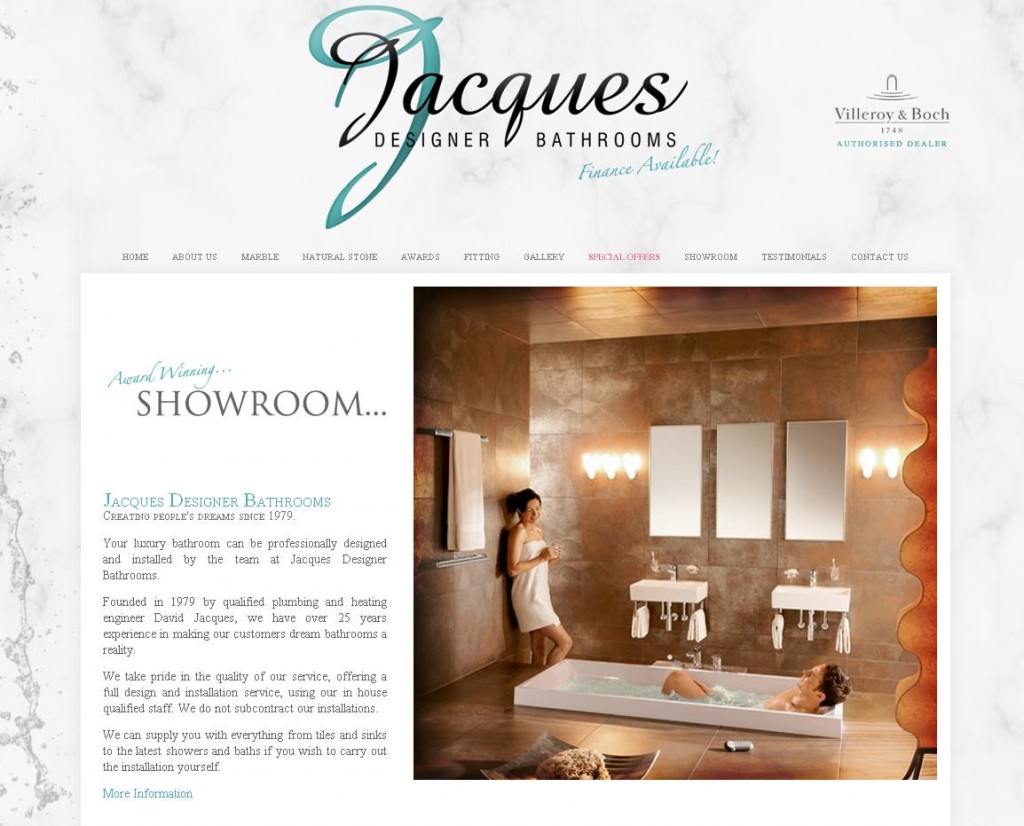
Jacques Designer Bathrooms is ‘more competitive than ever’ on the Web
Jacques Designer Bathrooms is a long standing eSterling client, having been with us since 2001. Over the past 10 years the web has changed dramatically, but eSterling has ensured that Jacques has been able to move with the times in order to outshine their competitors. The most recent development was put in place last year when Jacques had a new website designed by eSterling.
The new website features a simple layout with the emphasis being on the quality of Jacques Designer Bathrooms’ products and services. The overall function of the website is to be a platform for enquiries, as the bathrooms in which Jacques specialises need to be seen in person at their showroom to be fully appreciated.
To launch the new site an advanced SEO service was put in place to target a wider range of keywords. The work carried out by eSterling has produced excellent results for Jacques as many of the keywords, such as ‘designer bathrooms’, are ranking on page one of Google.
Jacques has also branched out from traditional SEO techniques and have used our press release service to drive traffic to their site. This also gave their rankings a boost, proving that this is a great technique to grow the profile of a business.
Bringing traffic to the Jacques Designer Bathrooms website is important for the development of the company at this stage, as potential customers are sure to want to take advantage of Jacques’ prices on designer bathroom suites and installation.
Managing director David Jacques said that the company’s pricing structure ‘is more competitive than ever’ so now is a great time to order a luxury bathroom. David also commented; ‘eSterling’s ongoing commitment to achieving results for my business has ensured that my site is visible online, even in difficult times for the industry.’
Web Design and SEO Go Hand in Hand
As we approach 2012 many of you will be looking to get a new website to go into the New Year with a virtual bang. I’m sure you don’t need me to tell you all the benefits a website has to offer as a place to showcase your products or services. A new website is no doubt a good move, but what if it can’t be found?
Your customers need to be able to find your site when they are searching for your products or services, which is where SEO comes in. SEO stands for search engine optimisation and it’s the behind the scenes stuff that gets your website noticed in Google. Without it, your website is like a shop with no signs – not good!
There will be some of you that already have SEO covered and your old website has brilliant Google rankings. Your customers are finding you, but when they get to your site they don’t like what they see. This is something we internet types refer to as ‘bounce rate’ – if your bounce rate is too high it means that too many customers are bouncing straight off your site using their metaphorical internet space-hopper. One way to make sure your customers stick around is to upgrade your website to something more modern, slick and shiny – a website to be proud of.
Whatever category you fall into, you need to be aware of the ways that SEO and web design can work together for you. A good internet solutions company (like eSterling of course) can help you with the complete package, making sure your website attracts visitors and keeps them interested.
Web design and SEO go hand in hand like fish and chips or gin and tonic… I just wish the web designers would learn this and make the SEO team a cup of tea once in a while!
The Benefits of Having a CMS
CMS stands for Content Management System and is a way of editing your website without the assistance of a web developer.
The key benefit of a CMS is the separation of design, content and structure which allows advantages throughout the lifecycle of your website. Each section can be amended independently, which allows you to change content without jeopardising the front-end design. This separation creates the flexibility of a CMS, allowing the editor to safely create content, add images, multimedia files and much more….
- Consistency of design is preserved.
Because content is stored separate from design, the content from all authors is presented with the same, consistent design. - Designed with non-technical content authors in mind.
If you can write an email, you can add content to your site! Absolutely no specialist knowledge required. - Decentralized maintenance.
You can edit anytime, from anywhere with an internet connection - Configurable access restrictions.
Users can be given certain permissions that prevent them from editing content which they are not authorized to change. - Navigation is automatically generated and adjusted.
Menus are generated automatically based on the database content meaning links would not point to non-existing pages. - Content is stored in a database.
Central storage means that content can be reused in many places on the website - Cooperation.
Encourages efficient and effective updates.
If you think you would benefit from having a CMS for your website please get in touch for a competitive quote.
Why scrolling on a website isn’t the end of the world
In our quest for constructive feedback from our clients, we often come across requests to scale a website down so that the whole page fits within the screen size. When a client asks for their site to appear ‘above the fold’, we always explain that this isn’t such a great idea and I’ll explain why…
New viewing mediums
With the web now extremely prominent on mobile phones and tablets and even HDTVs, the way the site can be viewed will be different on each platform. Users will also have a variety of different resolutions on their monitor and each browsers visible screen size will be different depending on the size of the toolbars. This means there isn’t a specific ‘above the fold’ point where all of the content must be.
Negative impact upon the design
If you scale down a website by around 300 pixels then the design of the site will significantly suffer. The original design will no doubt include plenty of white space around the design so the user can ‘breathe’ when looking through the site and everything is clear and easy to manoeuvre around. However, once that is removed and many of the elements are bunched up, the site will be a lot more difficult to scan and will probably result in the user either not noticing key information or not bothering to explore the site further.
Users are willing to scroll
Research has suggested that although the user will naturally spend more time looking at the top of your website, they are more than happy to scroll down to view more, especially if the site is designed to be scannable. In research carried out by ClickTale.com it found that 76% of users scrolled and that a good portion of them scrolled all the way to the bottom.

