If you’re looking to redesign your website, or even start a brand new website, it shouldn’t look like it was built in 2016. A contemporary design builds customer trust, and the features you employ can say a lot about your brand.
Whimsy, simplicity, and futuristic innovation can all be communicated through the design ideas and features that will be used on thousands of new websites this year.
Best Website Design Ideas in 2024
Designing websites is what we do, so we know when something good comes around. These ideas will make your site stand out and show off your brand.
How do I know if I need a new website?
Colourful Gradients
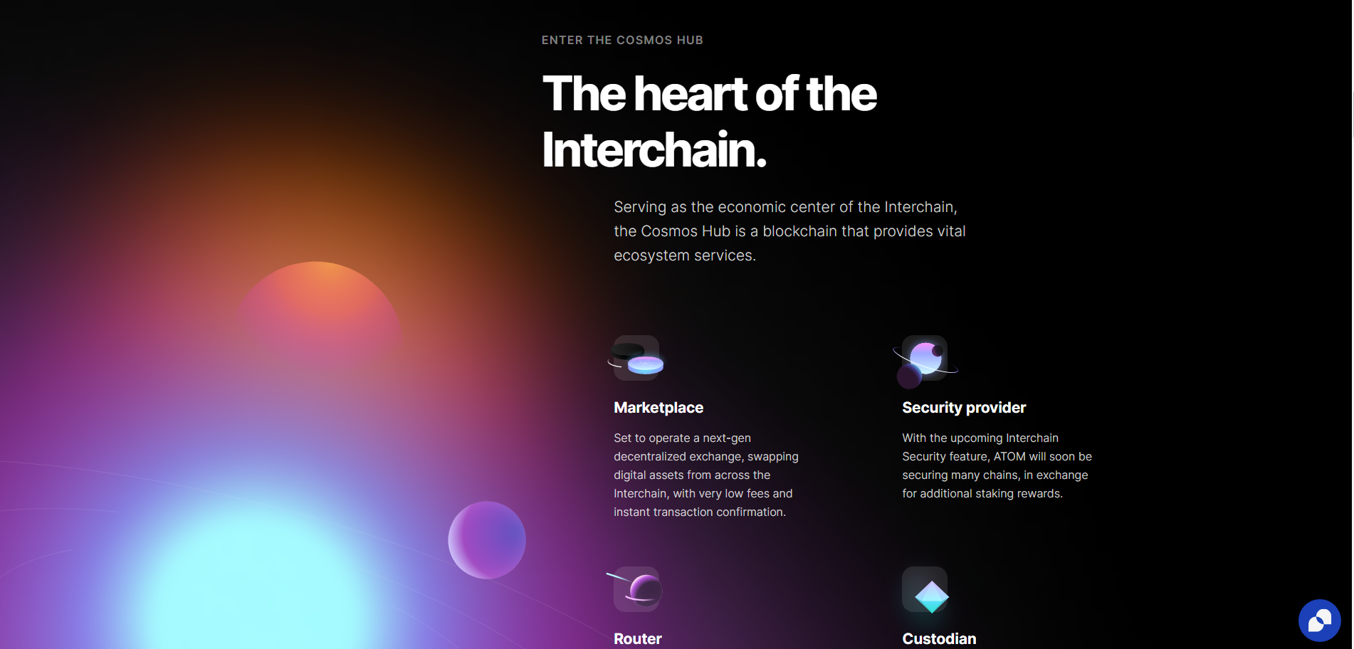
Rather than minimalist linear gradients, 2024 is about complex gradients that blend 3 or more colours. This creates depth and dynamic interest across the page and is perfect for brands where creativity is key.
A gradient like this can give sites a sense of space and light, even in dark mode, as this intergalactic example from Cosmos shows.
These creative colour gradients can also give website designs a psychedelic effect when combined with mouse interactions, as in is this award-winning design.
On this site, the user’s mouse sends liquid ripples through the header’s gradient. When highlighting text, the highlight itself is animated, fading from one colour to the next.
The downside of all this animation is, as stated above, the slow page speed, which indexes at 5.6s on Lighthouse. This could be caused by an array of complexities across the site, but we suspect the header is playing a role.
Dark Mode
With more and more apps adding Dark Mode in recent years, websites are following suit. In the early days of computing, we wanted to mimic the blank white page, or at least follow print with dark text on a lighter background.
Today, designers are more aware of blue light’s effects on sleep, computer use causing eye strain and conditions such as migraines and headaches. Dark mode is much more comfortable to read and provides a contemporary feel to any website design.
Dark-mode website design doesn’t just mean black backgrounds with white text. It can mean any colour palette where the text colour is lighter and brighter than the background. For example, this dark red palette from data science company Ventriloc. 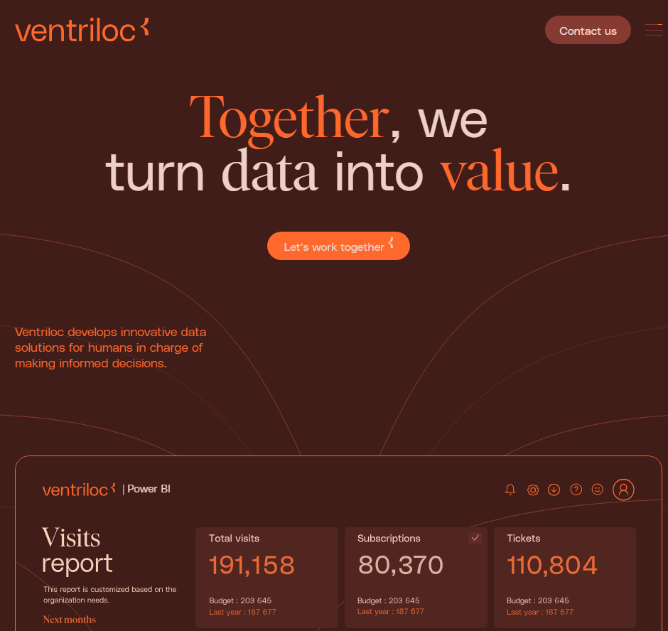
Grids, Outlines and Bento
Many new website designs are finding new aesthetics for their user interface. Instead of full-width sections, a grid helps designers show a lot of information without creating clutter.
Types of Grid Design:
- Informational: detailing features, USPs in neat, discrete sections
- Navigational: providing quick access to tools and service pages
- Aesthetic: communicating brand personality as organised, technical, and modern.
There are two different styles for these grids, however, with quite different effects.
Thin lines, flat colours and sharp edges
Some grids use thin, high-contrast borders to divide pages and menus. They often employ a low-impact colour palette and clean typography. This kind of design projects simplicity and a down-to-earth attitude, and is often used by companies working on sustainability and ethical business.
Curved Tiles on a Contrasting Background
The other side of the bento-grid coin is the designs that favour rounded tiles and complex colour palettes. They are much punchier and common in SaaS interfaces such as Pinterest and Spotify.
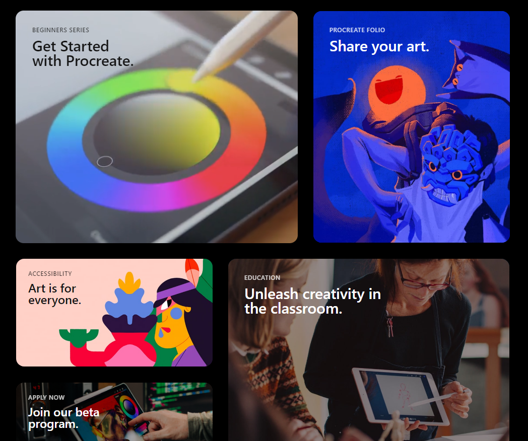
From Procreate.com
They are heavily used in Apple’s UX layouts and promotions, so wherever they appear they remind users of iPhones, app menus and the high-technology, futuristic atmosphere of the 2010s.
Amplify this futuristic appearance by adding shadows, gradients and dark mode designs.
If you’re interested in using a grid in your website design, make sure it matches your brand identity. Are you a back-to-basics, sustainable, salt-of-the-Earth company or a high-flying, hi-tech, streamlined business?
Custom Cursors
Custom cursors add novelty and whimsy to your digital branding. A cool new pizza restaurant could use a pizza slice cursor, for example. A dog-walking service could change the cursor into a chew toy.
This restaurant website design uses a peanut, chased by an elephant.
If it gels with your brand identity, this animation type can engage your ideal customers, turning your site into a game or a novelty. They spend more time on the site, looking for more fun features, and they develop an affinity for your brand.
They might even share your site just so their friends can see your cool cursor animation. All this makes them more likely to choose you when they’re ready to purchase.
A Hero’s Welcome: The Return of Static Hero Banners.
It’s goodbye to slideshow headers on homepages. These are fun when done well, but they can quickly grow too large, particularly with sub-optimal images. This slows the homepage down, with a negative effect on the whole design.
Slower site speeds mean potential customers navigate away, and search engines are less likely to rank the site on page 1.
Instead, 2024 will see a return to static hero banners. These high-definition banners fill the page right up to the fold. They’re responsive, having a great impact on desktop and mobile alike.
Hero Banners invite people to interact immediately and distil your branding into a focused message. This website design trend can do a lot for brands that prefer a focused user experience.
AI Design Features
AI has been the buzzword of digital circles for over a year now, and we are still seeing more use cases and innovations surfacing. While the basic Large Language Model content is nothing to write home about, the more advanced uses have us thinking.
Layout Generation
With machine learning, there are models like Hostinger that can create website layouts and templates, based on what most websites have already. It might not create anything ground-breaking, but it could give designers more time to focus on customisation and finer points.
Visual search
Using computer vision to recognise and identify certain objects, visual search functions have helped users identify plants, artists and landmarks, learning about the world through their phone camera.
In 2024, visual search will support eCommerce platforms by helping users find similar items for sale online. No more prying for where your friend got their trainers…
Dynamic Content Personalisation
By understanding how users interact with a site, AI can highlight content that may be most interesting to them. Just like Spotify’s playlist creation and recommendations, your website could create personalised wish-list suggestions, related products and blog recommendations.
Chat-bots
With AI content generators, customer service bots are likely to get an upgrade in 2024. They’ll be more able to write natural language, respond to technical commands and even walk users through payment processes. As long as your bot is equipped with the right API for your payment system, your website users will find making payments more accessible and satisfying.
Generative “Art”
AI has been making marketing imagery much quicker and cheaper for brands, and it looks like this will continue. AI art can mimic art media such as oil paints and charcoals, and styles such as cubism and pointillism.
We predict this will lead to a rise in complex imagery for some brands (where appropriate), as access to artistic images will no longer require artist and illustrator commissions.
**AI Pitfalls**
However, as fast and affordable as AI is making imagery, it is an imperfect solution. AI and generative art programmes frequently offer surreal additions to images, such as disembodied limbs or exaggerated facial expressions.
It also can never mimic true creativity. It is generative, not imaginative, and can only draw on what exists already.
For original art and thinking, brands will need to invest in human artists.
Kinetic Typography
Kinetic typography or dynamic typography is a feature that adds animation to text to create a whimsical and expressive home page feature. This is great as it can work as a loading animation, as in this zine from CashApp. It can also be triggered as a scroll animation, encouraging users to read to the end.
Accessible Website Design
In recent years, website designers have been paying more attention to accessibility for all. In part, this means enabling users that have disabilities, conditions or impairments which cause a barrier to internet use. Many people use assistive technology such as screen readers, magnifying software, closed captioning and eye trackers.
Accessible design takes proper coding to enable keyboard navigation, translation to audio or braille, or other enabling technologies. Make sure to include:
- Breadcrumbs to allow users to jump back up the page hierarchy
- Alt Text that describes the image accurately
- High colour contrast (above 4.5:1) to support users with low vision, colour blindness or migraine
- Descriptive link anchor text, not just “click here”.
- Semantic HTML such as heading, navigation and button tags to help assistive tech replicate the structure.
- ARIA (Accessible Rich Internet Applications) for elements that don’t have semantic HTML tags
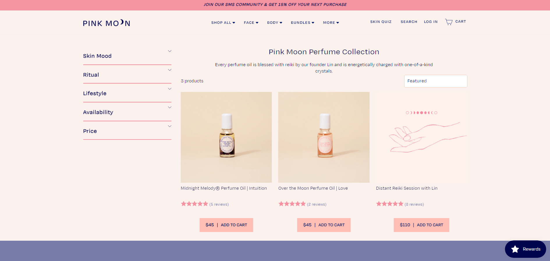
One great example of an e-commerce website that is beautiful and accessible is Pink Moon. This site has almost no contrast errors, it’s structured logically and uses semantic HTML and ARIA tags throughout.
Build it Well with eSterling
“As always, it’s contextual: You can look up some beautiful modern design techniques, but when you actually describe what they are, it’s similar to what we’ve always been doing, with a new twist. The way you use these design concepts is what makes a website look modern.”
Joel Birkett, Designer at eSterling Ltd.
There are fluctuations in web design trends, and the key is to understand which will stand the test of time. Is AI another bubble? Will custom cursors drive conversions? We’re willing to experiment with you. A lot of what makes today’s websites look brand new is similar to what’s gone before; the big impact is thanks to quality design.
