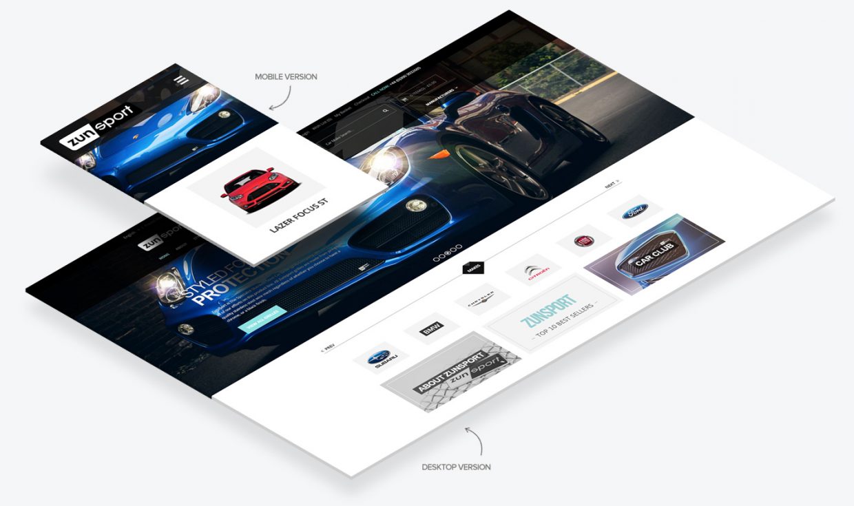
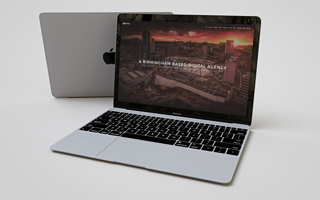
New Year, New Site?
If your site was built more than 2-3 years ago, it is likely that we can improve its performance.
We’d like to offer you a Free Website Audit to make sure your website lives up to your business potential.
Older sites can lose customers quickly, as their User Experience no longer meets customer expectations. Luckily, new developments in design capabilities and updated programming languages mean we can achieve greater functionality.
A fresh website design can offer:
- Enhanced User Experience: From slow, hard to navigate, and incompatible with modern devices to a seamless and enjoyable browsing experience
- Stronger Brand Image: From: a design that makes your brand look outdated and inauthentic to renewed credibility, professionalism and character
- Adapt to New Trends: From falling behind your competitors to integrating the latest in e-commerce functionality & dynamic content
All of this leads to higher conversion rates & customer retention and a boost to SEO performance. Ultimately, regular investment in your website looks after your most valuable digital asset.We’re here to help you build it better, so your site can work harder for your business.
Our website redesign services offer a user-centric design that keeps visitors engaged, improving the user experience and extending their stay. Enhanced SEO strategies increase organic traffic, while optimised conversion paths lead to higher ROI.
We ensure mobile responsiveness, content optimisation, and speedy loading times, all of which boost user satisfaction and SEO rankings. With the new Google Analytics 4, you gain valuable insights for continuous improvement, ultimately increasing revenue.
Get in touch today to enhance your online presence and take your website to the next level.
How Much Does Website Design Cost at eSterling?
A professionally made website, with hosting and ongoing support, is a good investment, but choosing an agency is much easier when you have an idea of how much the website will cost, and what you’ll get for it. We’re sharing our pricing policy to support you in your search for quality website design.
Of course, each business we speak to has their own requirements. Before we offer a quote, it’s imperative we know the targets of the new site so that we can provide adequate, targeted advice, and an accurate price estimate for the design.
We mainly create two types of websites: Brochure and eCommerce.
Brochure websites allow customers to view your range of products and services, learn more about your business and get essential information, such as deliveries. The key part of a brochure website is the contact page, because customers contact you to make enquiries and place orders directly.
eCommerce websites facilitate order placement through the site. Customers can view products details and place an order, paying online and giving their details for delivery. The website also shows information about your company.
How much does Brochure Website Design cost?
We quote based on what’s right for your business. There are many types of brochure website, so it’s important that we wait until we know your aims to determine what ingredients will help your business thrive.
Here’s a range of questions we’ll likely ask you prior to quoting:
- What makes your business different from the rest?
- Do you have a site map?
- Do you want to display previous works?
- Do you require a Blog or News Section?
- Does your business have any specific corporate branding?
- What is the main ‘Call to Action’ of the new site? (Essentially, what do you want your visitors to do?)
- What level of design would work best for your target audience? Simple, corporate or ‘WOW!’
These kinds of questions really give us an insight into the type of Brochure Website you’re after. They also give us some inspiration, which allows our years of experience to flourish. We’re then in a position where we can help, advise and support your new project.
Prices for Brochure Websites start from £3,000. The price we charge depends on your specific requirements, such as the number of pages you require and the level of design that would support your target market. Know that every decision made during the project is based on your goals and targets. We always try to share our knowledge and give the best advice we can to our customers.
How much does eCommerce Website Design cost?
eCommerce is a much more complex site structure than a brochure site, but it can be invaluable for businesses. You can’t hire a Salesperson who’s available 24/7 or is willing to take and process orders on Christmas Day!
No other asset will do what a well-built eCommerce website can do for a business – it’s that simple.
Just like Brochure websites, we ask questions before offering the best quote we can for the level of work required.
As well as the above questions, we’ll need to know:
- How many products?
- Do those products have options?
- Do those options change the price?
- Is there tiered pricing?
- How is shipping calculated?
- What payment provider(s) are you using?
All these questions need to be answered so we can plan out the project and provide a clear quote.
Part of the eSterling fact-finding stage involves our eCommerce Specification document. This is forwarded to all eCommerce prospects and gives us a solid foundation for the work.
Our eCommerce website design starts from £5,000. Some sites have more complexity than others, such as bespoke payment options, custom APIs and, simply, huge product ranges. The more complex the website, the more hours of design time and the more it will cost.
“You get what you pay for.”
In every industry around the world, this phrase is true but in Website Design, it’s very clear to see. Our industry is also populated with Freelancers, one-man-bands and people who have taken a six-week course in Web Design 101, who think they’re experts. This solo designer will not charge as much as us, but they are unlikely to have the range of skills and deep knowledge that you can get from an agency, and the job will not be as successful for your business.
When you’re dealing with a design agency that has been around for almost 25 years, you get a lot more for your money.
The ROI on an up to date, functional eCommerce website is enormous. This is largely due to modern customer expectations. Customers find it much more appealing to use a website where they can see all of the product information up front and make a purchase within minutes, without having to wait for a call back or an email chain to resolve.
Our eCommerce site designs are proven to increase conversions and build revenue for businesses quickly. Explore our previous work to see what we can do.
As well as the best in website design, you work with an experienced team of designers and developers working together on your project. Our team is made up of some of the best Designers and Developers in Birmingham, a dedicated Project Manager and access to one of the most dynamic Digital Marketing Departments around, all in house. And that’s all before your new website goes live!
After we launch your website, we’re still around for support. Your main contact will be our HelpDesk Department, who can help and advise you with any website queries you might have. You’re also in the capable hands of our Commercial Manager (Wave White) who can advise you on how to make the most of your website and be on hand to support your online presence.
Need help with your Website project or Digital Marketing?
Talk to one of our experts today on: 0121 766 8087
or
Call our Business Development Team on: 07533 898249
Web Design Trends for 2022
Whether you are an eSterling customer or just looking around the web for some solid design trends for your next project then you’ve come to the right place. Every year brings its own trends and design fads and only a very select few stick, so I’m here to go through the good and bad of trends for 2022.
Light / Dark Options
This particular trend involves giving the user the ability to view your site in either dark or light mode depending on their preference. Having initially come from the back of Android & Apple’s UI options there’s a good reason for this trend to really take off in 2022. It has been proven that dark-mode reduces eye strain and conserves battery power on Mobile, Tablets & Laptops so it’s got that going for it too.
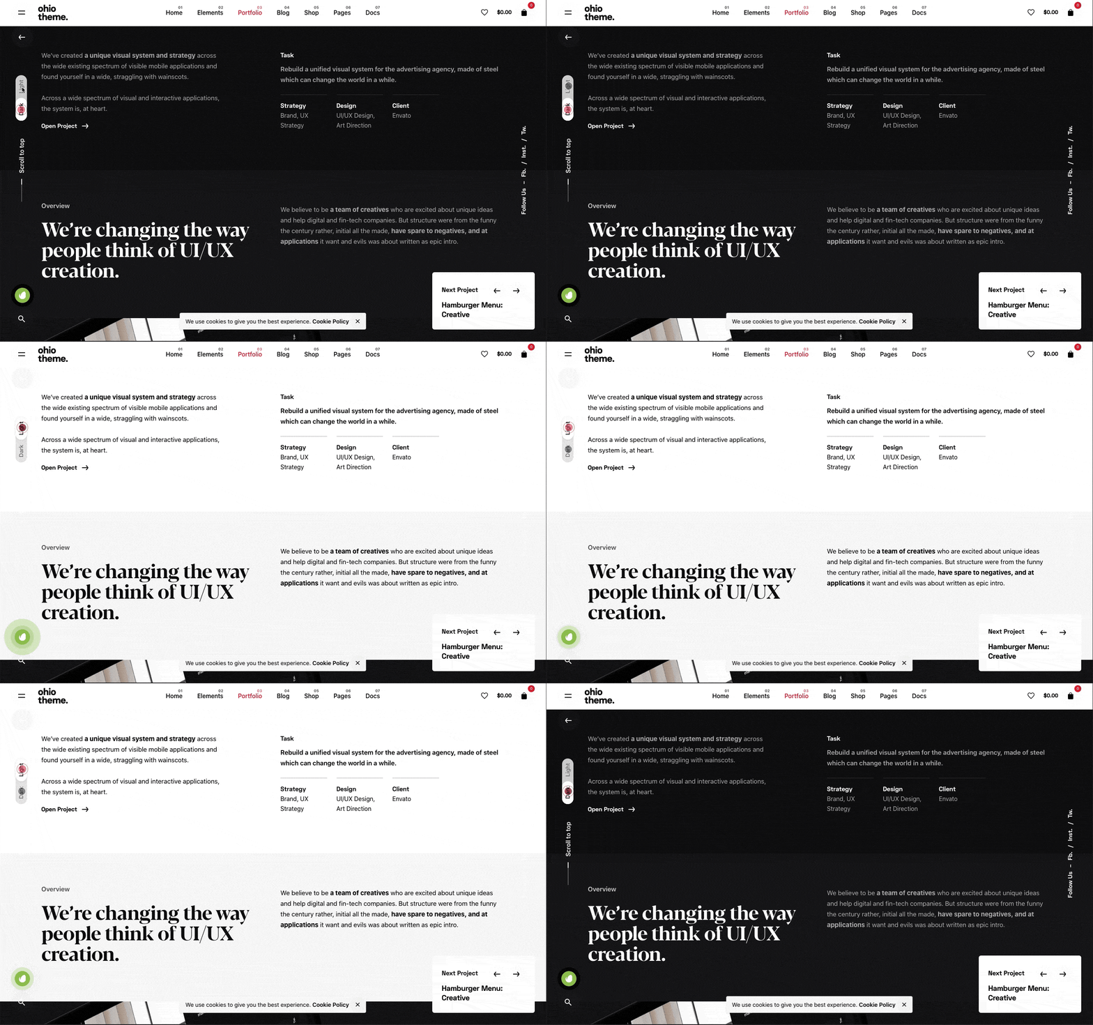
My take on this is a little more complex – I think if your websites traffic revisits your website either weekly or monthly then this would work and will give the user the impression that they’re getting a personalised experience.
If it’s added just because it’s a trend, then I’m not sure what value it really adds? Personally, I have Dark-mode set to my iPhone because I prefer the aesthetic but nothing more.
Would it work for your customers? What do you think?
Mesh Gradients
These are traditional gradients that include normally 3 or more colours that are pulled together to create a gradient effect that can be seen online more and more. You can use them as element backgrounds or as part of a hero section.
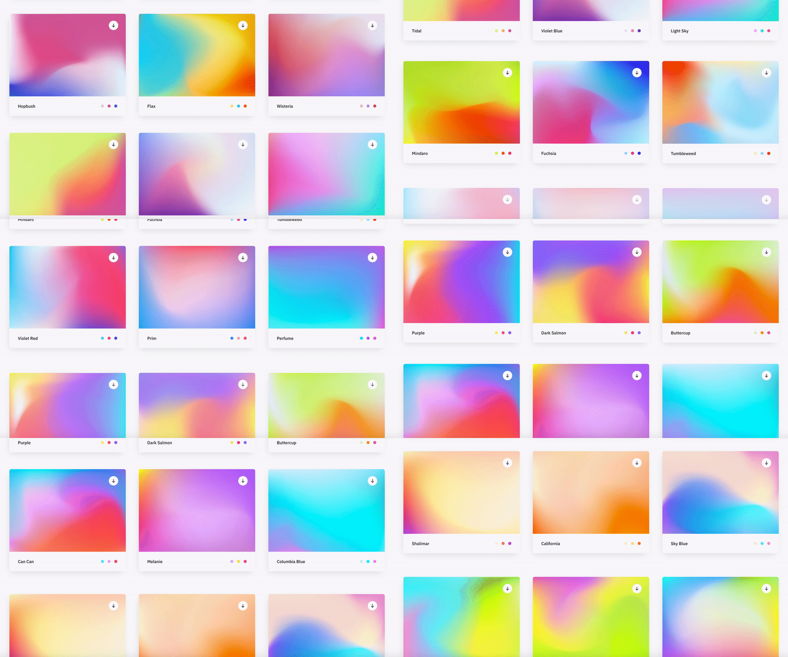
I’ve seen this as a design style for corporate brands to appear more contemporary and ‘fun’ especially used alongside bright, vivid colours.
Although this trend leans heavily on the colours that have been selected, if you choose the right combination, this trend can look eye-catching and quite impressive.
I think if the target audience is right, the branding colours lend themselves to this look, this could be a trend which will continue to be used throughout the 2020’s.
Most Minimalist Design
I feel the word ‘minimalist’ features on every single design trend since the early 00’s. This new take on minimalism removes all unneeded elements and leaves the bare essentials, replacing them with whitespace.

This look is mostly used for ultra-modern brands who seek to be associated with a contemporary, minimalist lifestyle. So this look would work for modern furniture stores, tech brands and clothing brands aimed at 18-30 year olds – It’s all about the target audience!
I personally love this look as it cuts out the BS and leaves just the product/content etc. but it’s not right for everyone.
Animating Icons
Now we’ve all seen the animated ‘menu’ or ‘hamburger’ icons which turn into a big ‘X’ to close the menu – Yes, this has been around for a while but LottieFiles has opened their doors and provided Web Designers with a toolbox of animated icons. I think this trend will really take off in 2022.
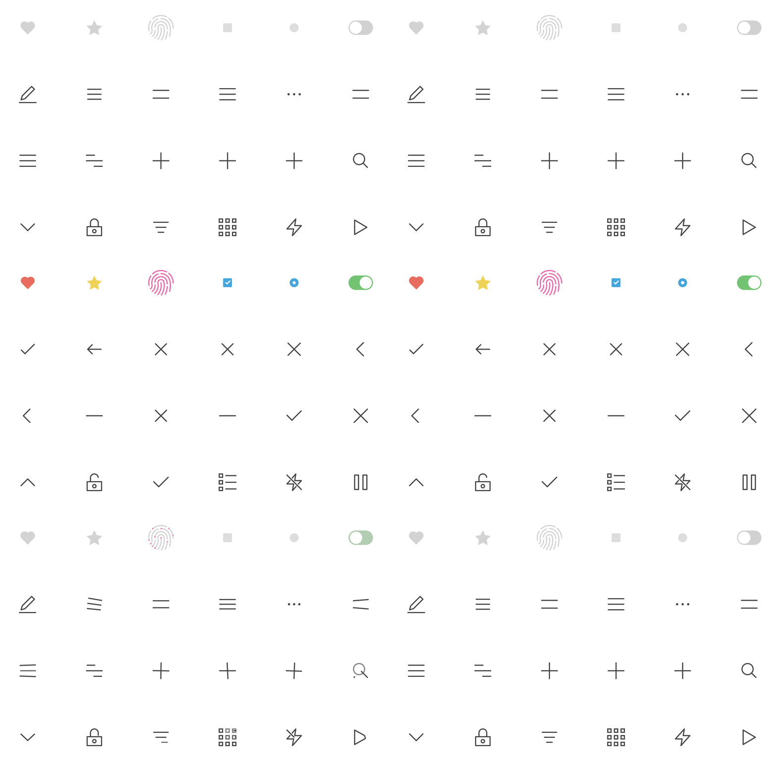
These light-weight icons can really enhance the UI of a website and as they’re SVG’s too – they are fully interactive on all devices and browsers.
When used correctly, this trend can really make a site look and feel more polished and complete. It gives the impression that the designer has taken their time to get things just right.
It’s a no-brainer, just do it!
General Advice
If I was asked to give our customers or other like-minded people some advice for the web in 2022, I would say the following 3 words: Speed, speed, speed.

With every passing month, Google reaffirms their stance on slow, poorly built websites stating that they will be penalised resulting in a lower Google ranking which could be devastating for small to medium sized businesses.
Essentially this could be the death of these ‘off-the-shelf’ website builders such as WIX, Mr Site, Et al. If building your own website is a serious option due to cost then I would say it’s not worth it. You could do more damage than you could imagine.
If you rely on website enquiries or calls originating from your site, if it doesn’t rank, you’re dead in the water. In essence, what Google are trying to do is promote well built, fast websites over the slower, more poorly built websites. The Google Core Vitals are the new metrics which will come into force that test your websites responsiveness, speed and performance and potential they could decide on the success of your website.
When is the right time to have a new website?
Letting a website linger way past it’s sell by date will have a lasting, negative impact on your business but knowing when to start again can be tricky, so here’s some tips and signs that will help you to know when to invest in a brand new website.
Here are some of the most obvious signs that your website needs a redesign:
The web has moved on.
The online industry moves at an incredible pace and new trends, techniques and layout options appear almost on a daily basis therefor it is inevitable that your website will be out of date at some point in the future. There is no getting away from this. Sure, you can re-skin a site (this can often be more expensive in the long run – Ed) and patch it up but your essentially putting a plaster on it until the next time.
Web Design trends are a funny business. They can have the ‘wow’ factor but they can also date a website badly. I have a checklist which let’s me know if a trend is here to stay:
- Does it improve the User Experience?
- Does it improve website performance?
- Would the website be a success without it?
- Does it help the site achieve it’s goals?
Using this checklist I have been able to utilise existing a new trends which are of benefit to the site as a whole.
The site is no longer fit for purpose.
If your website is effecting your day to day running or you can identify holes in the online ordering process the site is already not fit for purpose. Your website should work with your business and not produce problems or extra work for employees. it can often be frustrating if you are constantly working around your site or having to change your workflow because of it.
Using a Content Management System (CMS) that is not intuitive can also lead to frustration. It is important that you are fully trained to use your particular CMS once the site is built and neglecting this can lead to struggles further down the line.
If your website no longer works for you but against you, it’s time for a redesign.
Your competitors are way ahead
This is a particularly tricky arena because sometimes following the trends of the market leaders can reap excellent rewards because your new and existing client base will already be familiar with the look and feel of your website and will reflect a professional approach to your business.
On the other hand, sometimes it is better to stand out from the crowd and put design first to help you achieve this. An example of this can seen with Apple in 90’s when they decided to produce desktop machines that looked totally different to the beige boxes that were on the market at the time. Apple pivoted to put the emphasis on design led products which reaped dividends.
This choice is normally dictated by what market sector your business is in so consult an expert on the subject to find the best approach for your business.
You’ve not updated in ages
The average lifespan for a well designed website is normally 3-4 years but in all honestly, if you had a website built yesterday and it was built poorly, it’s already time for a redesign! We get that your busy with the day to day operations of your business but your prospective customers want signs that you’re professional about all aspects of your business and a dated looking website is a surefire way of losing potential business.
Your website should be your statement, your first impression and if it’s dated or worse still, broken or not rendering correctly in modern browsers it will be harming your image and your reputation as a business.
Don’t fall into the trap of thinking “It’s only a website”. In most cases it’s the first place people go when speculating your services.
If you could attribute at least one of the following words or phrases to your existing website it’s time for a redesign:
- dated
- slow
- bloated
- confusing to use
- not rendering correctly
- not mobile friendly
- hard to update
- Content Management System is confusing.
If you’re wondering whether having a new website will help you gain business via enquiries or you want more traffic to your website, the simple answer is no. In this instance I would advise you to read about Search Engine Optimisation before completely rebuilding a possibly perfectly good website.
Conclusion
If you can relate to any parts of this post then you already know whether or not to redesign.
Having a new website built begins with an aim, a purpose. “What do you want your website to do for your business?” is one of our first questions we ask and we go from there. Make lists of requirements, functionality, sitemaps and anything else you can think of! Be open and honest and set goals. Take advice and if it is inline with your website’s goals then go for it! Employ designers and developers that have a track record of delivering and for that reason alone, eSterling is a great place to start.
Behind the Scenes of the new eSterling Website
The new eSterling website has been a labour of love for myself for just over 18 months now and the result is so far removed from the original ideas and sketches I created back in the winter of 2015.
As we know everyone’s a critic so I knew my ideas had to be solid and without doubt, the right way to go. So with that in mind I set about tearing through the old eSterling website to find a more streamlined sitemap which focussed on three main elements:
- Who are we?
- What do we do?
- Evidence of our success
Once I got a defined page list I was able to begin sketching out the main pages which were to make up the bulk of the new website.
It quickly became evident that the copy from the old website did not have the tone I wanted for the new website – it was stuffy and very formal. So with the help of the beautiful people from our SEO department we were able to come up with more relaxed, engaging copy which reflected a more friendly approach.
After sketching out the layouts of all the main sections of the website and confirming the UI elements, I finally opened Photoshop to address the design’s look and feel. Once I’d selected the right design elements according to our branding guidelines and created some concepts from within Photoshop the home page began to take shape.
The home page dictates the style of the whole website and therefore, at that stage every design decision was pivotal in the make-up of the new site. Now, I would be lying if I said that this stage took a couple of days, it in fact took 3 months! The structure, layout, typography, imagery and individual elements had to flow and with this in mind I began to obsess over every little detail.
I had to draw a line in the sand and when I saw that my revisions were not as good as what I had originally designed I realised I had to move forward or risk the whole project going stale.
Decisions, decisions…
I then had a home page which I was (generally) happy with, the mobile and tablet versions were created alongside the desktop version using Photoshop’s lovely Art board feature.
So, do we need a CMS? If so, WordPress? What responsive framework do we use? Maximum grid width? Which font repository do we use?
In short I went with the following:
- No CMS – More light weight and we’re web professionals – we shouldn’t need a CMS to update our own website!
- A much scaled down version of Foundation – Light weight and simple to use
- Fluid grid system of 100% & 1200px – Why tie yourself down to just 1?
- Google Fonts – They have the right fonts and in the right weight
It’s these decisions that we make daily that are vital for any website we build, not just our own.
…It’s off to work we go
At this stage I was fully entrenched in Sublime Text trying to create the best website I’ve ever made. Beautiful, fast, informative, responsive, easy to follow, the list goes on! It was very challenging and a lot of fun!
I would often ask my fellow designers for their input and something which kept coming up was imagery. We lacked high quality images of the staff and premises so I scoured the web for Birmingham based photographers who could come in to eSterling Towers and take some beautiful pictures of the staff at work.
The name that jumped out was Ross Jukes. He was only in the office for what felt like 10 minutes but he produced some really amazing pictures for the new website. We hope you like them because we certainly do! Ross is available for commercial work so visit his website here.
The Launch
When taking on positive/negative criticism it is important for any designer to keep the initial vision and aim of the site firmly in mind. If any advice or criticism deviates from the original plan, discard it with a polite ‘Yea, I’ll look into it’, but it is just as important to accept criticism when it works towards your original goals. Don’t be too stubborn to accept it with a ‘Yea, that’s a good shout’.
Once the team had taken a good look at the website and decided it was ready, we then set about launching eSterling.co.uk v3.0.
The website launched on Thursday 4th August 2016 and I really hope you like it.
Special mentions: Richard Locke, Wave White & Antoniya Darova for glorious PHP and copy that makes sense!
Calling all Web Designers!
eSterling are expanding again. We are on the hunt for an experienced digital designer to join our team at our Birmingham offices.
This is a fantastic opportunity with one of the Midlands most productive agencies. There is a structured career path with an opportunity for the right person to play a part in our creative direction and be at the beginning of an exciting growth phase – and be rewarded for it!
You are a Digital/Web Designer with an exceptional appreciation for graphic design including typography, colour and space with great attention to detail. You’re able to communicate your ideas and have an exceptional digital portfolio. Ideally having worked in a fast-paced agency environment for big brands.
Requirements:
- Excellent eye for design with great attention to detail
- Thorough understanding of and experience in layout, colour theory and typography in digital media.
- Fluent in current graphic design and web design practices using software such as Adobe Photoshop
- Strong design style, including creative design solutions within the constraints of web-based technologies.
- Strong knowledge of HTML and CSS
- Solid understanding of the technical abilities and limitations of web and mobile technologies.
- Ability to effectively manage multiple projects of varying complexities, meet deadlines and work well under pressure
- Proven experience of working well within design and development teams
- A strong digital portfolio
Advantageous:
- Experience of responsive web layouts
- Mobile UI design experience, both for apps and websites
- Experience of brand development and design for print
- Experience using the WordPress framework
You’ll be hungry to win awards, and may well have several already tucked under your belt. You’ll be confident in front of clients and happy to pitch your ideas to the boards of some of the country’s biggest brands.
All candidates wishing to apply for this role should submit their CV and portfolio to careers@esterling.co.uk
STRICTLY NO AGENCIES PLEASE.
Salary range: £16,000-£24,000 p/a
Photoshop CS 6 Beta – Features & Review
 Firstly, let me say that I’ve been using Photoshop since Photoshop 3 and I mainly use Photoshop for Web Design so I’ll be looking at the features the will directly effect myself and other Web Designers.
Having used Photoshop CS6 for just over 5 days now the first thing that strikes me is the performance! It feels a lot faster than CS5 and more sturdy. Cmd + N (New document) and the new document panel opens up almost instantaneously – pixels don’t need 4-5 seconds to render properly and even better, applying filters is now faster than ever! I don’t have a particularly fast machine but even I can notice the difference.
Without going into photo effects too deeply I feel I must mention the new blur filters you can apply. The new Tilt-Shift & Bokeh (A design trend which makes me gag) filters are an absolute dream to use, they’re so easy to use you won’t have to invest much time in learning how to use them. The Tilt-shift filter in particular is so powerful you can create the miniature feel to any photo within a minute. Although it was possible to replicate these effects in Photoshop without the aid of these new tools, having the facility to do so really lets you explore the possibilities and puts you in full control of the results.
The visual indicators on CS6 are a massive jump in the right direction. Instead of inserting markers where an object should be, visual indicators tell you the items margins and how far you’ve moved it and if you change the dimensions of an item, they tell you how much you’ve increased it by. When using a brush, the indicators let you know its diameter, hardness and opacity – small stuff I think you’ll agree, but useful none the less.
Layer Search – Yes my friends, the time has finally come. So you’ve designed a websites home page, you’ve racked up nearly 200 layers / 30 groups and you haven’t got the time to trawl though the groups to find THAT layer, this is where layer search comes in. For Web Designers this is something that we’ve been hoping for, for a while now. It works amazingly well too, you can search by name, mode, effect attribute and colour.
Type styles are a great addition to CS6. For front end developers like myself this feature brings the world of CSS closer to Photoshop than ever before. This tool enables us to apply styles to text elements within a single text box which are re-usable throughout the PSD. So you can create classes called Heading1, Heading 2, paragraph, and link etc and Photoshop will use your defined classes through out the PSD. Brilliant!
The new GUI (Graphical User Interface) is interchangeable and great to use. There are four light/dark options which can really make the canvas be the point of interest. My personal preference is the dark option but I’ve only been using it a week so that may change! I think I may change the UI dependant on the design I’m working on at the time.
There are many other new features for photographers and other users alike such as the new set of content aware tools and the video editing suite so there’s plenty to get your teeth stuck into.
Overall, I think there has only been a handful of really impressive Photoshop upgrades, Photoshop 7 & CS2 spring to mind – but I really feel with the features added to CS6 this is a giant leap for Photoshop and really improves its overall usability. The fact that a lot of the new features are aimed at Web professionals helps enormously. Adobe seemed to have realise the we use this application every single day so improving the small things leads to a more pleasurable way of working.
Well it’s fair to say I’m smitten but as I’ve said, I’ve only used it for a week. I’m sure I’ll find a glitch or two!
Whats missing – I believe there is still a gap in photoshop for a tool which makes it easy to add Depth of Field to photographs, sure there are tutorials on how to do this but a specific tool would save time and would be a welcome addition. Maybe a level of theme creation linked to WordPress would also be a good feature, but hey! Thats just me being selfish!
Here’s some useful video’s which illiterate some of the new features of Photoshop CS6
Content Aware:
Video Overview:
Download the Beta for yourself: http://labs.adobe.com/downloads/photoshopcs6.html
About Photoshop CS6 Beta: http://labs.adobe.com/technologies/photoshopcs6/
Web Design in 2012
In 2012 it will become more and more easy to add a little sparkle to your web site with animations and traditions. Improved Animation is set to take hold , providing new ways to display and animate content on your web site. Banner animations will diversify too and will feature new ways of animating such as Nivo Slider.
Responsive Design will really make strides in 2012. A web site built in Responsive Design will display in different ways dependent on the environment it is displayed in. There will be easier ways to implement this capability on site builds and Media Queries will develop and become the first port of call for any web designer / developer.
1 page web sites will come back with a vengeance in 2012. Sites like Minimo will become a viable option for start-ups and small businesses worldwide. Their simplicity and easy-to-use UIs (user interfaces) make them the perfect type of site to generate business and Google rankings!
Web Typography is also growing at a rapid pace. Gone are the days of Time New Roman and Arial! With the use of services such as the Google Web Font it is becoming easier to make a websites content look beautiful and engaging! This is sure to a massive influence on how we view the web in 2012.
jQuery is Javascript framework which creates dynamic and engaging web elements on your web site. The jQuery gurus at Codrops created some mind boggling web elements in 2011 so even the thought of where jQuery can do in 2012 gives me butterflies!
The capabilities of CSS3 will lead to progressive user interfaces, which is a great thing for UI Designers and users too! CSS3 will let Web Designers render web elements the way they were intended, leaving much of the bug fixes and such like behind. This will also lead to more time designers spend designing in the browser which is about as hands on as it gets! For more info on CSS3 go here
But, to be perfectly honest all I want from the web in 2012 is for one browser to rise up and become the dominant browser. If 99% of all people browsing the web used just one browser, my days wouldn’t be filled with fixing browser bugs for INTERNET EXPLORER!
Not going to happen – but a web designer can dream can’t he?
Why I Use Twitter
Why do I use Twitter and what do I get out of it? First of all I read many articles about how great Twitter is and how to use it but I don’t see many articles about what people get out of it. So here’s my take on why I personally use Twitter and how to get the most out of it.
First of all, I should tell you I have a lot of hobbies and interests. Im not one of these people who get’s home from work and sits in front of the TV – I’m not having a go at people like that – hey, whatever makes you happy.
I like to create stuff. My main hobby is music and in particular writing and recording music. I use twitter to find out about all of my favourite artists – news, gigs, interviews, videos, documentaries, new releases and memorabilia. For example, I first found out Noel Gallagher was recording his debut solo album from Twitter, not BBC News, not google or the NME, but Twitter. A lead singer from a band that were in the same recording studio tweeted Noel Gallagher was in the studio opposite recording his new album! Brilliant!
When it comes to my hobby of writing and recording music I follow people who will help me to improve what I do. I use Garageband to record my music so I follow Garageband experts and Garageband Software Developers who help me to improve the production of my music. Simple. From Twitter, I learnt of a piece of software that would give me a brilliant drum sound for my songs, I brought the software and it’s improved my songs 10 fold! I would never have known about it if it wasn’t for Twitter.
I first learnt of the deaths of Michael Jackson and Amy Winehouse on Twitter and I don’t follow any news corporations. News travels fast on Twitter and you tend to be on the cusp of every major news story around the world.
I remember watching the shocking scenes of the London Riots live on my TV and simultaneously checking my twitter feed to hear the latest goings on from people I knew in those areas. Eventually a whole movement was created from Twitter that night. An every day person started a campaign to ‘Reclaim the Streets’ eventually amassed thousands of people to help clean up the streets of London the very next day.
Im also interested in gadgets (boys toys) so I follow Apple news and rumours. I hear all the latest about gadgets from all over the world. I learnt about ‘FaceTime’ on Twitter when the news broke months before any major news station caught on. I learnt of the death of Steve Jobs on Twitter and the subsequent fall out all came from Twitter
I know what your thinking – ‘You’ve got loads of interests – How would I use it?’
Well my Wife has no hobbies but she too is a Twitter user. She follows actors and actresses, music artists, celebs, friends and family members. She loves it, she’s forever asking me if I’ve seen this tweet, or that tweet.
An old friend of mine who I only see about 3 times a year is a regular tweeter and I get to hear about what he’s up to so when we meet up its all the richer for conversation pieces.
The simple fact is that Twitter is for everyone and everyone can get something out of it. Sign up and search for things you would like to know more about…its that simple
How We Work
If you’ve decided it’s time to have a new web site but don’t really know what to do about it, here’s an insight into how we operate and how we deliver your brand new web site.
Initial Meeting
One of our Web Specialists will come out to you and talk about your requirements over a coffee. As we’re the specialists, we will also offer up alternatives and other idea’s which you may have not thought about. Once the initial Web Site Spec (site navigation, functionality requirements etc) is in place we are then able to give a fair an competitive price. The choice is then yours to go with us or to seek alternative quotes.
Accepted Quote
If you choose us, we will send you out a Welcome pack which features your Web Site Spec, Contact Information, Terms & Conditions and an introduction to your team. We also normally require a deposit of around 30% with all new web site orders.
Our Project Coordinator will then get in touch to discuss, in more detail, your design requirements, functionality and any other requirements you may have. At this point we also request any content and imagery you might want on the web site. We appreciate that the day to day running of your company must be your priority but without content a web site is simply an empty shell so if you need help writing content about your company and what services/products you offer simply give us a call or read our How to write content for your web site article. If needs be we can source images from iStock Photos on your behalf.
When the above is done, we then commence designing your brand new web site.
Web Site Production
Depending on your requirements we will offer two different types of initial proofing.
We will either show you an initial working version of your new site or we will show you a static version of your newly designed home page. You then have the opportunity to fine tweak it until you are happy with the new look. Once the visuals are agreed we then continue with the development of the web site and insert your content and imagery.
Functioning Proof
Once the web site is packed with all your new features, content and imagery, we then show you a functioning proof which is basically a finished version of your web site for you to check over and approve. At this point the onus is on functionality rather than anything visual. Once you are happy with the web site, we request that you sign our Web Site Acceptance Form which confirms that you are happy for the new web site to go live. Then we make steps to put the site live, add any SEO (Search Engine Optimisation) that maybe required, double check all contact forms and general functionality.
Going Live
Once the web site is put live we double check everything to make sure your new web site is perfect!
If you have any questions about the above simply email us at helpdesk@esterling.co.uk or give us a call on 0121 766 8087


