Speed up your website with an Image Audit
If your website is unusually slow, an image audit might be a quick way to reduce the server space it is using.
Check how many image files are stored on your website server, especially if you use WordPress. If your website is slow, it’s usually because the server has to search through reams of data to find the required files. You can makeyour website leaner by cutting down the files stored on the server. This is one of those boring jobs that can improve user experience and help your business make sales. (It also reduces the energy used when people access your website, improving your web sustainability.)
What is taking up so much server space?
Sometimes Redbox and other disk storage readers will show 20Gbs used, when WP only shows 1Gb.
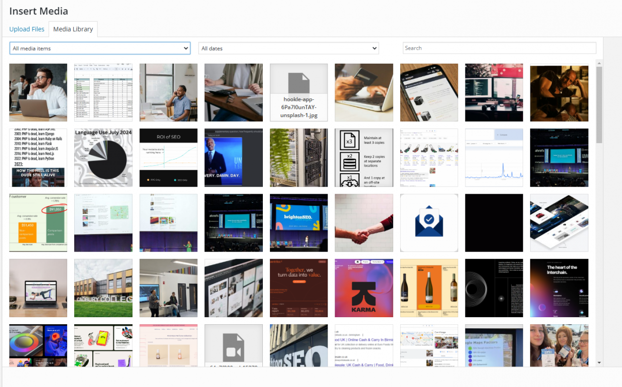
WP routinely generates multiple files for each item in your Media library. For each image upload, WordPress creates 3 versions in Thumbnail, Medium and Large. It might also store rotated & cropped versions.
This is to make it easier for you to select different image sizes, but it can become a problem when your site has thousands of images.
Most large websites use >4000 images. This translates to >12,000 images in the folder that are functionally the same image.
There could also be unused files that are no longer linked on the site but are in the uploads directory.
How to Conduct an Image Audit:
- Check all image sizes: the bigger the initial upload, the more impact this duplication issue has. You might be able to export a list of media files and their sizes.
Best practice is to routinely compress images before uploading them, using TinyPNG or another web tool.
- Run a thumbnail regeneration and remove all the image sizes you don’t need.
Force Regenerate Thumbnails is a WP plugin that deletes old image sizes and regenerates thumbnails.
- If this doesn’t work thoroughly, large sites may need a scripted solution in CSS.
Check with the theme for which images have been generated, then script a deletion. Look for commonalities between the file names of unwanted images, such as the generated size. Write the script to search for and remove file names that contain this commonality, “-1243×1809”, for example.
- Finally, prevent repeat instances. Install an image compressing API such as TinyPNG API or WP SmushPro.
This can halve the server space used for large sites with high volumes of images.
Speed up your website with an image audit
Cutting down the unwanted files on your website has a huge impact on load times because the server does not have to search through so much data to return each page when someone accesses your site. A faster website offers a better user experience, which has a knock-on effect on both SEO and conversions: it’s worth doing.
While it sounds like a simple process, an image audit can be hundreds of hours of work when you manage a large website. If your in-house team doesn’t have time, it’s worth talking to an agency. At eSterling, we manage hundreds of websites and offer support with audits like these. Contact eSterling today at 0121 766 8087, or email hello@esterling.co.uk.
New Year, New Site?
If your site was built more than 2-3 years ago, it is likely that we can improve its performance.
We’d like to offer you a Free Website Audit to make sure your website lives up to your business potential.
Older sites can lose customers quickly, as their User Experience no longer meets customer expectations. Luckily, new developments in design capabilities and updated programming languages mean we can achieve greater functionality.
A fresh website design can offer:
- Enhanced User Experience: From slow, hard to navigate, and incompatible with modern devices to a seamless and enjoyable browsing experience
- Stronger Brand Image: From: a design that makes your brand look outdated and inauthentic to renewed credibility, professionalism and character
- Adapt to New Trends: From falling behind your competitors to integrating the latest in e-commerce functionality & dynamic content
All of this leads to higher conversion rates & customer retention and a boost to SEO performance. Ultimately, regular investment in your website looks after your most valuable digital asset.We’re here to help you build it better, so your site can work harder for your business.
Our website redesign services offer a user-centric design that keeps visitors engaged, improving the user experience and extending their stay. Enhanced SEO strategies increase organic traffic, while optimised conversion paths lead to higher ROI.
We ensure mobile responsiveness, content optimisation, and speedy loading times, all of which boost user satisfaction and SEO rankings. With the new Google Analytics 4, you gain valuable insights for continuous improvement, ultimately increasing revenue.
Get in touch today to enhance your online presence and take your website to the next level.
How Much Does Website Design Cost at eSterling?
A professionally made website, with hosting and ongoing support, is a good investment, but choosing an agency is much easier when you have an idea of how much the website will cost, and what you’ll get for it. We’re sharing our pricing policy to support you in your search for quality website design.
Of course, each business we speak to has their own requirements. Before we offer a quote, it’s imperative we know the targets of the new site so that we can provide adequate, targeted advice, and an accurate price estimate for the design.
We mainly create two types of websites: Brochure and eCommerce.
Brochure websites allow customers to view your range of products and services, learn more about your business and get essential information, such as deliveries. The key part of a brochure website is the contact page, because customers contact you to make enquiries and place orders directly.
eCommerce websites facilitate order placement through the site. Customers can view products details and place an order, paying online and giving their details for delivery. The website also shows information about your company.
How much does Brochure Website Design cost?
We quote based on what’s right for your business. There are many types of brochure website, so it’s important that we wait until we know your aims to determine what ingredients will help your business thrive.
Here’s a range of questions we’ll likely ask you prior to quoting:
- What makes your business different from the rest?
- Do you have a site map?
- Do you want to display previous works?
- Do you require a Blog or News Section?
- Does your business have any specific corporate branding?
- What is the main ‘Call to Action’ of the new site? (Essentially, what do you want your visitors to do?)
- What level of design would work best for your target audience? Simple, corporate or ‘WOW!’
These kinds of questions really give us an insight into the type of Brochure Website you’re after. They also give us some inspiration, which allows our years of experience to flourish. We’re then in a position where we can help, advise and support your new project.
Prices for Brochure Websites start from £3,000. The price we charge depends on your specific requirements, such as the number of pages you require and the level of design that would support your target market. Know that every decision made during the project is based on your goals and targets. We always try to share our knowledge and give the best advice we can to our customers.
How much does eCommerce Website Design cost?
eCommerce is a much more complex site structure than a brochure site, but it can be invaluable for businesses. You can’t hire a Salesperson who’s available 24/7 or is willing to take and process orders on Christmas Day!
No other asset will do what a well-built eCommerce website can do for a business – it’s that simple.
Just like Brochure websites, we ask questions before offering the best quote we can for the level of work required.
As well as the above questions, we’ll need to know:
- How many products?
- Do those products have options?
- Do those options change the price?
- Is there tiered pricing?
- How is shipping calculated?
- What payment provider(s) are you using?
All these questions need to be answered so we can plan out the project and provide a clear quote.
Part of the eSterling fact-finding stage involves our eCommerce Specification document. This is forwarded to all eCommerce prospects and gives us a solid foundation for the work.
Our eCommerce website design starts from £5,000. Some sites have more complexity than others, such as bespoke payment options, custom APIs and, simply, huge product ranges. The more complex the website, the more hours of design time and the more it will cost.
“You get what you pay for.”
In every industry around the world, this phrase is true but in Website Design, it’s very clear to see. Our industry is also populated with Freelancers, one-man-bands and people who have taken a six-week course in Web Design 101, who think they’re experts. This solo designer will not charge as much as us, but they are unlikely to have the range of skills and deep knowledge that you can get from an agency, and the job will not be as successful for your business.
When you’re dealing with a design agency that has been around for almost 25 years, you get a lot more for your money.
The ROI on an up to date, functional eCommerce website is enormous. This is largely due to modern customer expectations. Customers find it much more appealing to use a website where they can see all of the product information up front and make a purchase within minutes, without having to wait for a call back or an email chain to resolve.
Our eCommerce site designs are proven to increase conversions and build revenue for businesses quickly. Explore our previous work to see what we can do.
As well as the best in website design, you work with an experienced team of designers and developers working together on your project. Our team is made up of some of the best Designers and Developers in Birmingham, a dedicated Project Manager and access to one of the most dynamic Digital Marketing Departments around, all in house. And that’s all before your new website goes live!
After we launch your website, we’re still around for support. Your main contact will be our HelpDesk Department, who can help and advise you with any website queries you might have. You’re also in the capable hands of our Commercial Manager (Wave White) who can advise you on how to make the most of your website and be on hand to support your online presence.
Need help with your Website project or Digital Marketing?
Talk to one of our experts today on: 0121 766 8087
or
Call our Business Development Team on: 07533 898249
Website Design Trends 2024
If you’re looking to redesign your website, or even start a brand new website, it shouldn’t look like it was built in 2016. A contemporary design builds customer trust, and the features you employ can say a lot about your brand.
Whimsy, simplicity, and futuristic innovation can all be communicated through the design ideas and features that will be used on thousands of new websites this year.
Best Website Design Ideas in 2024
Designing websites is what we do, so we know when something good comes around. These ideas will make your site stand out and show off your brand.
How do I know if I need a new website?
Colourful Gradients
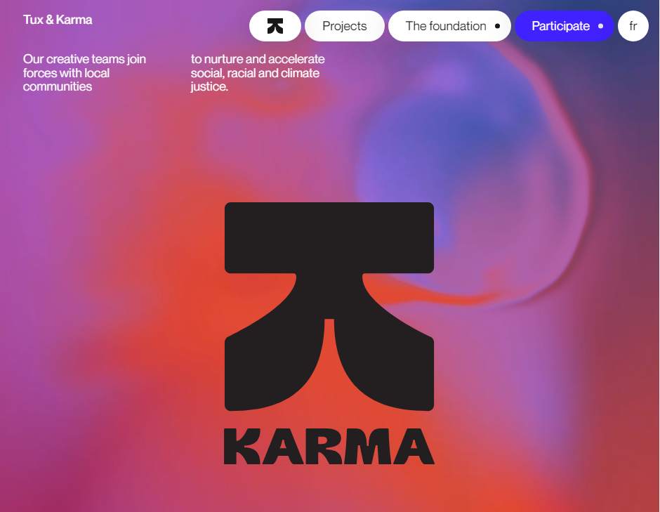
Rather than minimalist linear gradients, 2024 is about complex gradients that blend 3 or more colours. This creates depth and dynamic interest across the page and is perfect for brands where creativity is key.
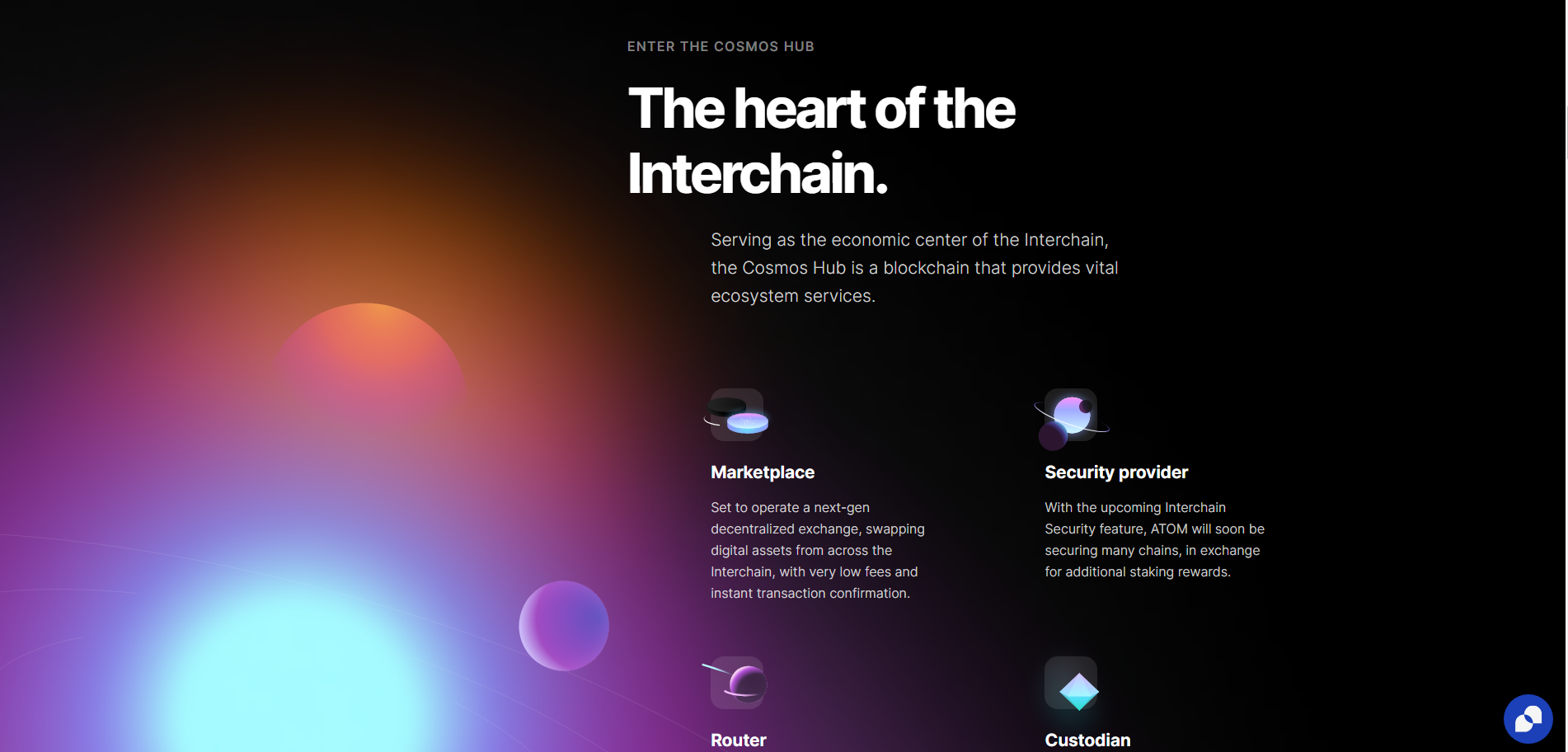
A gradient like this can give sites a sense of space and light, even in dark mode, as this intergalactic example from Cosmos shows.
These creative colour gradients can also give website designs a psychedelic effect when combined with mouse interactions, as in is this award-winning design.
On this site, the user’s mouse sends liquid ripples through the header’s gradient. When highlighting text, the highlight itself is animated, fading from one colour to the next.
The downside of all this animation is, as stated above, the slow page speed, which indexes at 5.6s on Lighthouse. This could be caused by an array of complexities across the site, but we suspect the header is playing a role.
Dark Mode
With more and more apps adding Dark Mode in recent years, websites are following suit. In the early days of computing, we wanted to mimic the blank white page, or at least follow print with dark text on a lighter background.
Today, designers are more aware of blue light’s effects on sleep, computer use causing eye strain and conditions such as migraines and headaches. Dark mode is much more comfortable to read and provides a contemporary feel to any website design.
Dark-mode website design doesn’t just mean black backgrounds with white text. It can mean any colour palette where the text colour is lighter and brighter than the background. For example, this dark red palette from data science company Ventriloc. 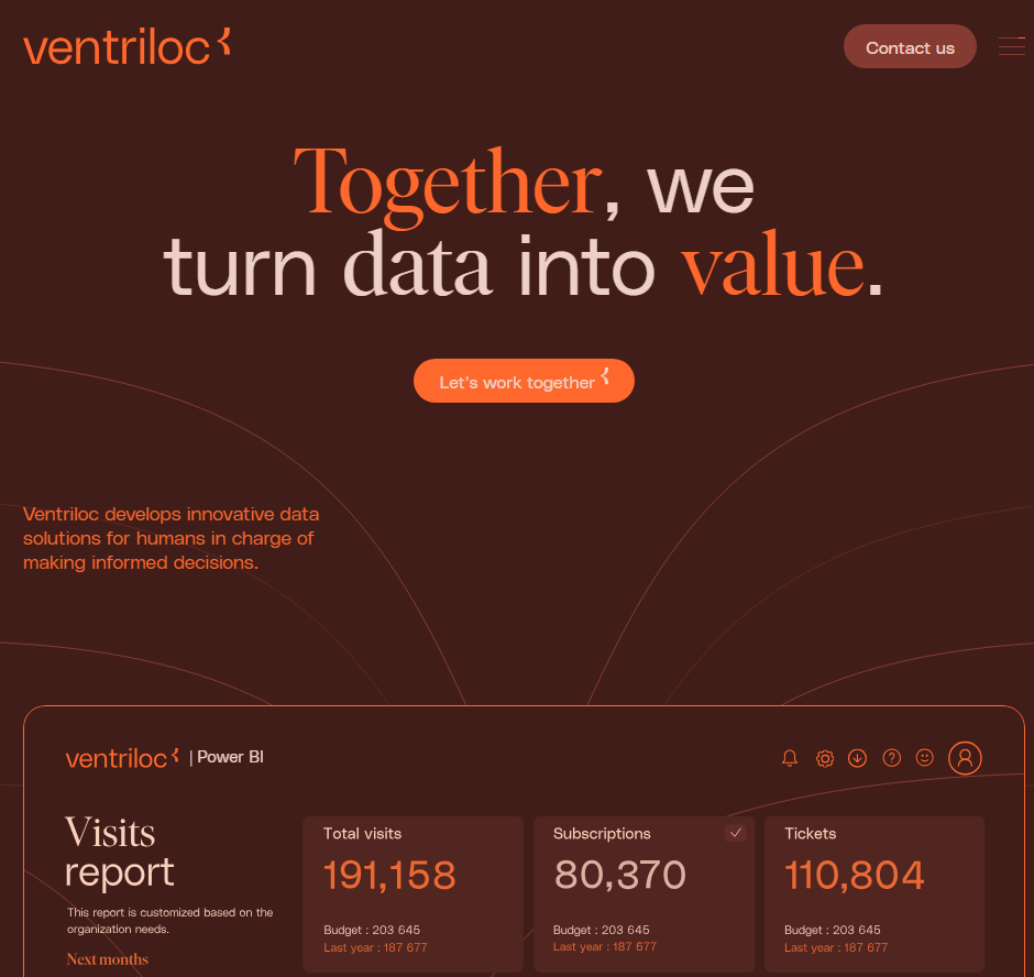
Grids, Outlines and Bento
Many new website designs are finding new aesthetics for their user interface. Instead of full-width sections, a grid helps designers show a lot of information without creating clutter.
Types of Grid Design:
- Informational: detailing features, USPs in neat, discrete sections
- Navigational: providing quick access to tools and service pages
- Aesthetic: communicating brand personality as organised, technical, and modern.
There are two different styles for these grids, however, with quite different effects.
Thin lines, flat colours and sharp edges
Some grids use thin, high-contrast borders to divide pages and menus. They often employ a low-impact colour palette and clean typography. This kind of design projects simplicity and a down-to-earth attitude, and is often used by companies working on sustainability and ethical business.
Curved Tiles on a Contrasting Background
The other side of the bento-grid coin is the designs that favour rounded tiles and complex colour palettes. They are much punchier and common in SaaS interfaces such as Pinterest and Spotify.
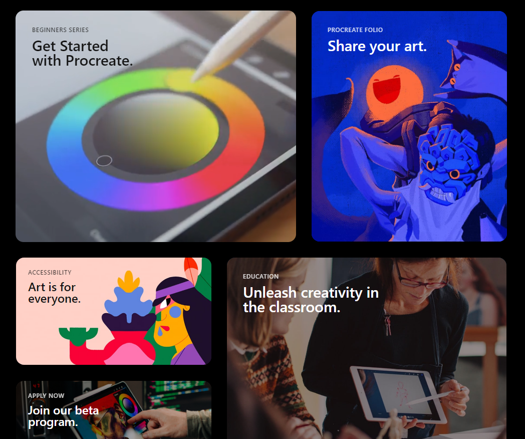
From Procreate.com
They are heavily used in Apple’s UX layouts and promotions, so wherever they appear they remind users of iPhones, app menus and the high-technology, futuristic atmosphere of the 2010s.
Amplify this futuristic appearance by adding shadows, gradients and dark mode designs.
If you’re interested in using a grid in your website design, make sure it matches your brand identity. Are you a back-to-basics, sustainable, salt-of-the-Earth company or a high-flying, hi-tech, streamlined business?
Custom Cursors
Custom cursors add novelty and whimsy to your digital branding. A cool new pizza restaurant could use a pizza slice cursor, for example. A dog-walking service could change the cursor into a chew toy.
This restaurant website design uses a peanut, chased by an elephant.
If it gels with your brand identity, this animation type can engage your ideal customers, turning your site into a game or a novelty. They spend more time on the site, looking for more fun features, and they develop an affinity for your brand.
They might even share your site just so their friends can see your cool cursor animation. All this makes them more likely to choose you when they’re ready to purchase.
A Hero’s Welcome: The Return of Static Hero Banners.
It’s goodbye to slideshow headers on homepages. These are fun when done well, but they can quickly grow too large, particularly with sub-optimal images. This slows the homepage down, with a negative effect on the whole design.
Slower site speeds mean potential customers navigate away, and search engines are less likely to rank the site on page 1.
Instead, 2024 will see a return to static hero banners. These high-definition banners fill the page right up to the fold. They’re responsive, having a great impact on desktop and mobile alike.
Hero Banners invite people to interact immediately and distil your branding into a focused message. This website design trend can do a lot for brands that prefer a focused user experience.
AI Design Features
AI has been the buzzword of digital circles for over a year now, and we are still seeing more use cases and innovations surfacing. While the basic Large Language Model content is nothing to write home about, the more advanced uses have us thinking.
Layout Generation
With machine learning, there are models like Hostinger that can create website layouts and templates, based on what most websites have already. It might not create anything ground-breaking, but it could give designers more time to focus on customisation and finer points.
Visual search
Using computer vision to recognise and identify certain objects, visual search functions have helped users identify plants, artists and landmarks, learning about the world through their phone camera.
In 2024, visual search will support eCommerce platforms by helping users find similar items for sale online. No more prying for where your friend got their trainers…
Dynamic Content Personalisation
By understanding how users interact with a site, AI can highlight content that may be most interesting to them. Just like Spotify’s playlist creation and recommendations, your website could create personalised wish-list suggestions, related products and blog recommendations.
Chat-bots
With AI content generators, customer service bots are likely to get an upgrade in 2024. They’ll be more able to write natural language, respond to technical commands and even walk users through payment processes. As long as your bot is equipped with the right API for your payment system, your website users will find making payments more accessible and satisfying.
Generative “Art”
AI has been making marketing imagery much quicker and cheaper for brands, and it looks like this will continue. AI art can mimic art media such as oil paints and charcoals, and styles such as cubism and pointillism.
We predict this will lead to a rise in complex imagery for some brands (where appropriate), as access to artistic images will no longer require artist and illustrator commissions.
**AI Pitfalls**
However, as fast and affordable as AI is making imagery, it is an imperfect solution. AI and generative art programmes frequently offer surreal additions to images, such as disembodied limbs or exaggerated facial expressions.
It also can never mimic true creativity. It is generative, not imaginative, and can only draw on what exists already.
For original art and thinking, brands will need to invest in human artists.
Kinetic Typography
Kinetic typography or dynamic typography is a feature that adds animation to text to create a whimsical and expressive home page feature. This is great as it can work as a loading animation, as in this zine from CashApp. It can also be triggered as a scroll animation, encouraging users to read to the end.
Accessible Website Design
In recent years, website designers have been paying more attention to accessibility for all. In part, this means enabling users that have disabilities, conditions or impairments which cause a barrier to internet use. Many people use assistive technology such as screen readers, magnifying software, closed captioning and eye trackers.
Accessible design takes proper coding to enable keyboard navigation, translation to audio or braille, or other enabling technologies. Make sure to include:
- Breadcrumbs to allow users to jump back up the page hierarchy
- Alt Text that describes the image accurately
- High colour contrast (above 4.5:1) to support users with low vision, colour blindness or migraine
- Descriptive link anchor text, not just “click here”.
- Semantic HTML such as heading, navigation and button tags to help assistive tech replicate the structure.
- ARIA (Accessible Rich Internet Applications) for elements that don’t have semantic HTML tags
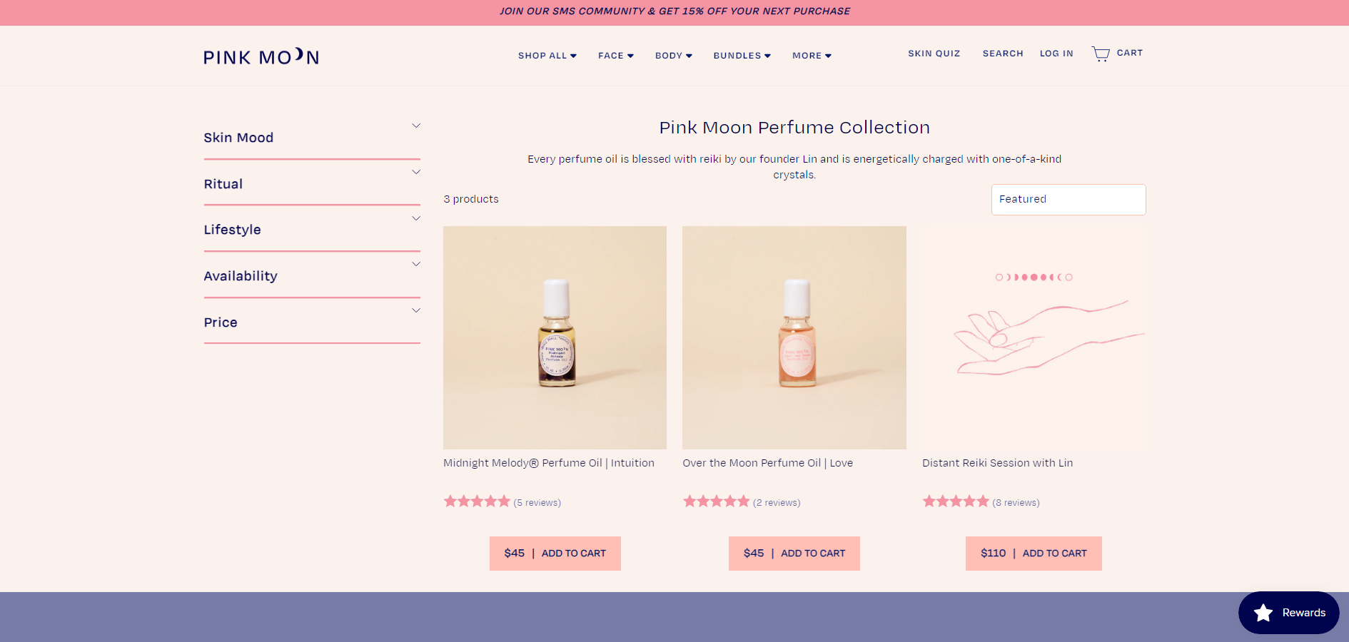
One great example of an e-commerce website that is beautiful and accessible is Pink Moon. This site has almost no contrast errors, it’s structured logically and uses semantic HTML and ARIA tags throughout.
Build it Well with eSterling
“As always, it’s contextual: You can look up some beautiful modern design techniques, but when you actually describe what they are, it’s similar to what we’ve always been doing, with a new twist. The way you use these design concepts is what makes a website look modern.”
Joel Birkett, Designer at eSterling Ltd.
There are fluctuations in web design trends, and the key is to understand which will stand the test of time. Is AI another bubble? Will custom cursors drive conversions? We’re willing to experiment with you. A lot of what makes today’s websites look brand new is similar to what’s gone before; the big impact is thanks to quality design.
9 Signs That It’s Time To Redesign Your Website
As customer expectations move at the pace of the web, letting a website linger way past its sell-by date will have a lasting, negative impact on your business. Deciding when to start again can be tricky, so we’ve put together a guide to summarise some of the signs that show it is time to invest in a brand-new website.
In 2023, we know it’s never “just a website”. In most cases, your website gives people the first impression of your business, so having an up-to-date, user-friendly and fast website gives you the best chance to generate more business.
Quick Check: Why might I need a new website?
You know it’s time for a new website when yours is:
- Dated
- Slow
- Difficult To Use
- Doesn’t Render Correctly
- Not Mobile Friendly
- Hard To Update
In this guide, we’ve put together 9 reasons businesses need a new website so that you can assess for yourself whether it’s time to get a redesign. Many of these are rooted in the expectations of potential customers searching online today.
Here, we’ll cover the 9 reasons to get a new website:
- Your website looks dated
- The site is no longer fit for purpose
- Your competitors are way ahead
- You’ve not updated your website for a long time
- Your website isn’t easy to use on mobile devices
- It’s slow to load
- Customers find it difficult to use
- Your Employees find it difficult to use
- Employees are spending a long time working on the website
1. The web has moved on, and your website looks out of date.
The online industry moves at an incredible pace. There are new web design trends, techniques and layout options almost daily, so it is inevitable that your website will be out of date to a degree, and there is no getting away from this. Sure, you can re-skin a site and patch it up, but you’re essentially putting a plaster on it until the next time, and it will cost you more in the long run.
While some website trends come and go, it’s clear when a website looks dated. Customers searching for the first time make huge assumptions based on the quality of a website, and one that looks more suited to 2013 than 2023 will turn people off, losing potential business. But how can you tell which website trends are worth pursuing, and which will simply date your website further in a few years’ time?
Rather than falling for the ‘wow’ factor, this checklist helps us identify the trends that are here to stay:
Does it improve the User Experience? If it helps people navigate your website better or have more enjoyment from using your site, it’s worthwhile.
Does it improve website performance? A new design could decrease loading times, or help the website function in a more integrated way.
Would the website be a success without it? If it ain’t broke, don’t fix it – there’s no point in adding superfluous trendy features to an already successful website. But if it could be the lynchpin that holds the whole user experience together, go for it!
Does it help the site achieve its goals? Bespoke website design rejects the idea that there’s a one-size-fits-all formula for every business’s website. Each design is grounded in the specific goals of the business, guiding us to choose only the features that will advance the site towards them.
Using this checklist, I have been able to utilise existing new trends which are of benefit to the site as a whole and understand which trends to dismiss.
2. The site is no longer fit for purpose.
 Sometimes the lack of functionality of a website is affecting the day-to-day running of your business, or you can identify holes in the online ordering process. When this happens, the site is working against you, rather than attracting and converting customers.
Your website should work with your business, not produce problems and extra work for employees. It can often be frustrating if you are constantly working around your site or having to change your workflow because of it.
If your website no longer works for you but against you, it’s time for a redesign.
3. Your competitors are way ahead.
 This is a particularly tricky arena. Sometimes following the trends of the market leaders can reap excellent rewards because your new client base will already be familiar with the look and feel of your website, and it will reflect a professional approach to your business.
On the other hand, trying to keep up with competitors can lead to looking the same as everyone else, which is just as unhelpful as having a dated site. Rather than simply copying your competitors, updating your website can help your brand to stand out from the crowd.
We achieve this with a Design-First approach, putting the needs of your customer and their journey through the site before aesthetic changes.
This is the same approach used by Apple in the 90s when they decided to produce desktop machines that looked totally different to the beige boxes that were on the market at the time. Apple pivoted to emphasise design-led products and reaps the rewards to this day.
The decision to update in line with competitors or innovate to stand out normally depends on what market sector your business is in, so consult a web design expert to find the best approach for your business.
4. You’ve not updated in ages
 The average lifespan for a well-designed website is normally 3-5 years, depending on the sector and competitors. In all honesty, if you had a website built yesterday and it was built poorly, it’s already time for a redesign! The day-to-day operations of your business can take up a lot of time, but without showing your prospective customers a professional and usable interface, you will struggle to gain their trust and increase purchases.
Your website should be your statement: your first impression. If it’s dated or, worse still, broken or not rendering correctly in modern browsers, it will be harming your image and your reputation as a business.
As developments in website creation, browsing and hosting capabilities progress rapidly, the longer you leave it to update your website, the more problems will arise. For example, if your website is using a payment method that hasn’t been updated since 2019, most likely it is not compatible with SCA (Strong Customer Authentication) systems such as 3DS2.
Using an outdated, non-compliant payment method is problematic for your customers and your business, as customers will be unable to pay, get frustrated and leave. We recommend simply using up-to-date payment methods that allow quick checkout. The best of these are self-contained and protected under a green lock (HTTPS) SSL certificate.
5. Your website isn’t easy to use on mobile devices
 Ensuring your site can adapt to mobile phone screens, accounting for the differences in dimensions and orientation, is particularly important in today’s mobile markets. Responsive web design is a standard these days because almost everyone searches for services and products on their mobile phones more frequently than on a desktop computer.
If your website is not responsive, users will need to scroll sideways or zoom in to read the text. But mobile users are all about convenience. Rather than going to the extra effort, people will simply move on to one of your competitors. It is absolutely paramount to have a website design that can provide a positive user experience on every device, using responsive design.
6. It’s slow to load
 Websites that take more than 3 seconds to load lose potential customers quickly. With millions of search results, at least 53% of users will simply click on the next link instead of waiting for a slow website, so it’s important to get this fixed quickly.
However, it may not be as simple as patching or reducing the number of plugins. Your website might need an updated CMS or a full overhaul to get speeds up to scratch.
It’s easy to assess your website’s speed with tools such as PageSpeed Insights. If you find that things are taking a while to appear, it’s worth speaking to a web designer who can advise as to what is slowing your website down.
7. Customers find it difficult to use: You need UX Design
 User Experience (UX) is important to factor in when deciding whether your website needs a redesign. If it’s too difficult for visitors to your website to find what they need, purchase products or understand what your services are, you are missing out on potential business. The journey from your homepage or landing page to the checkout or enquiry can be simplified and directed even if your offering has many complex layers, with some clever UX design.
This usually involves creating an easy-to-follow “navigation flow”. If the flow is interrupted or not fluid, visitors can be frustrated and have a tendency to leave. In certain situations, there are accepted standards and habits that customers follow which we can play into to create easy navigation. For example, an eCommerce platform usually shows the cart or basket icon visibly in the top right of the page.
If your eCommerce site makes the customer search for the basket or scroll a long way to add products to the basket, or if the information around product pricing, VAT or deliveries is difficult to find, then your customer will struggle to complete the purchase, and you lose the sale.
8. Your Employees find it difficult to use: You need an up-to-date CMS
 Using a Content Management System (CMS) that is not intuitive can also lead to frustration, delays and damage to your visibility online. With a small amount of training, you should be able to manage content on your website yourself, adding blog posts and new product pages in a few easy clicks via the admin area.
But if your CMS is out of date, it may not be user-friendly and require a more specialised operation, costing you more in the long run and leading to struggles further down the line.
9. Employees are spending a long time working on the website
 Even with a usable CMS and appropriate training, there may be long processes of updating the website which can now be solved. For example, your website may be requiring a lot of manual work from you and your team to process enquiries and orders.
New integrations and automation options are being released all the time, so it may be worth updating your website to make the most of these algorithms, APIs and widgets.
If you can relate to any parts of this post, then you already know whether or not to redesign.
Having a new website built begins with an aim: a purpose. One of the first questions we ask is: “What do you want your website to do for your business?” and we go from there.
A new website can be tailored specifically to your goals, whether it’s lead generation or helping customers find information easily. A website redesign can help with:
Improved Branding: An updated website with a modern design can promote trust and brand recognition among consumers and improve the overall design and quality of the website can help to evaluate the trustworthiness of the company, thus enhancing the brand image and keeping the business relevant.
Smooth information flow: The core goal of a website is to provide information that helps visitors learn more about the business, products/services, and ultimately close deals, by having an optimal information flow and a website redesign can help to structure and present the information in a way that all the important stuff is easy to find.
Reduced business costs: A complete website redesign allows for re-evaluation of hosting and CMS, can run more efficiently, save costs in the long run, and cut costs of missed opportunities and lost revenue caused by an outdated website.
More sales and business: A website redesign allows you to make conversions the primary focus by presenting a flow of information that guides visitors towards actions such as purchase, subscription, or request for more information, which is something that older websites often fail to do effectively.
If you’re hoping a new website will help you gain business via search inquiries or if you just want more traffic to your website, you may be looking in the wrong place. In this instance, I would advise you to read about Search Engine Optimisation first, before completely rebuilding a possibly perfectly good website.
To get the most out of your website design, make sure your designers understand your requirements, functionality and sitemaps. Be open and honest and set goals. Take advice and, if it is in line with your website’s goals, then go for it! Employ designers and developers that have a track record of delivering. For that reason alone, eSterling is a great place to start.
Web Design Trends for 2022
Whether you are an eSterling customer or just looking around the web for some solid design trends for your next project then you’ve come to the right place. Every year brings its own trends and design fads and only a very select few stick, so I’m here to go through the good and bad of trends for 2022.
Light / Dark Options
This particular trend involves giving the user the ability to view your site in either dark or light mode depending on their preference. Having initially come from the back of Android & Apple’s UI options there’s a good reason for this trend to really take off in 2022. It has been proven that dark-mode reduces eye strain and conserves battery power on Mobile, Tablets & Laptops so it’s got that going for it too.
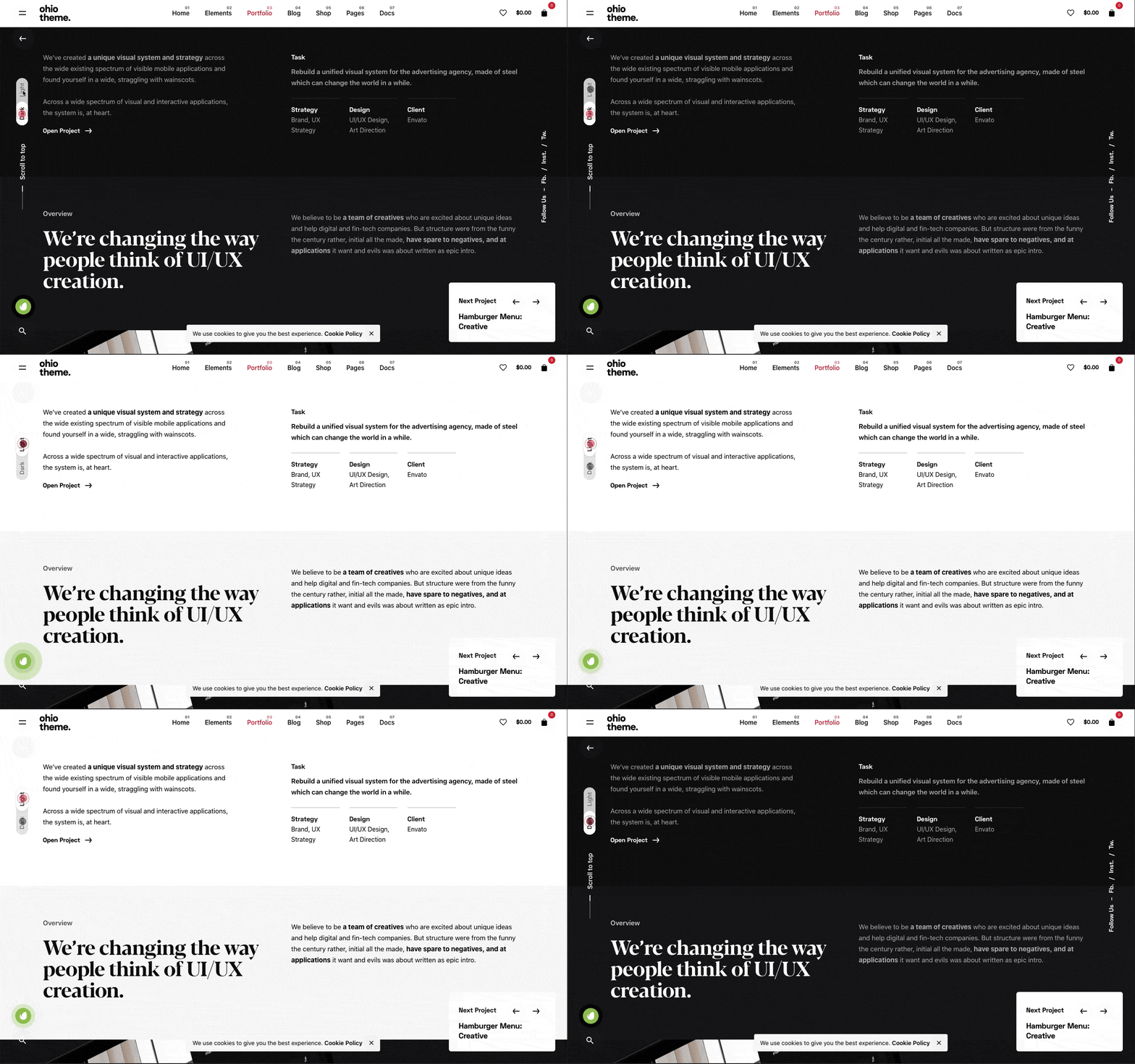
My take on this is a little more complex – I think if your websites traffic revisits your website either weekly or monthly then this would work and will give the user the impression that they’re getting a personalised experience.
If it’s added just because it’s a trend, then I’m not sure what value it really adds? Personally, I have Dark-mode set to my iPhone because I prefer the aesthetic but nothing more.
Would it work for your customers? What do you think?
Mesh Gradients
These are traditional gradients that include normally 3 or more colours that are pulled together to create a gradient effect that can be seen online more and more. You can use them as element backgrounds or as part of a hero section.
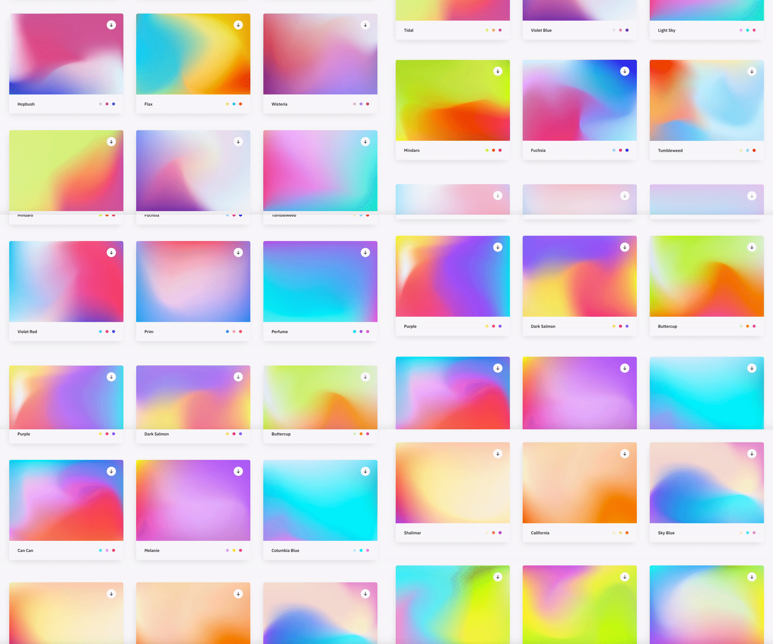
I’ve seen this as a design style for corporate brands to appear more contemporary and ‘fun’ especially used alongside bright, vivid colours.
Although this trend leans heavily on the colours that have been selected, if you choose the right combination, this trend can look eye-catching and quite impressive.
I think if the target audience is right, the branding colours lend themselves to this look, this could be a trend which will continue to be used throughout the 2020’s.
Most Minimalist Design
I feel the word ‘minimalist’ features on every single design trend since the early 00’s. This new take on minimalism removes all unneeded elements and leaves the bare essentials, replacing them with whitespace.

This look is mostly used for ultra-modern brands who seek to be associated with a contemporary, minimalist lifestyle. So this look would work for modern furniture stores, tech brands and clothing brands aimed at 18-30 year olds – It’s all about the target audience!
I personally love this look as it cuts out the BS and leaves just the product/content etc. but it’s not right for everyone.
Animating Icons
Now we’ve all seen the animated ‘menu’ or ‘hamburger’ icons which turn into a big ‘X’ to close the menu – Yes, this has been around for a while but LottieFiles has opened their doors and provided Web Designers with a toolbox of animated icons. I think this trend will really take off in 2022.
These light-weight icons can really enhance the UI of a website and as they’re SVG’s too – they are fully interactive on all devices and browsers.
When used correctly, this trend can really make a site look and feel more polished and complete. It gives the impression that the designer has taken their time to get things just right.
It’s a no-brainer, just do it!
General Advice
If I was asked to give our customers or other like-minded people some advice for the web in 2022, I would say the following 3 words: Speed, speed, speed.

With every passing month, Google reaffirms their stance on slow, poorly built websites stating that they will be penalised resulting in a lower Google ranking which could be devastating for small to medium sized businesses.
Essentially this could be the death of these ‘off-the-shelf’ website builders such as WIX, Mr Site, Et al. If building your own website is a serious option due to cost then I would say it’s not worth it. You could do more damage than you could imagine.
If you rely on website enquiries or calls originating from your site, if it doesn’t rank, you’re dead in the water. In essence, what Google are trying to do is promote well built, fast websites over the slower, more poorly built websites. The Google Core Vitals are the new metrics which will come into force that test your websites responsiveness, speed and performance and potential they could decide on the success of your website.
Here’s why your website needs Google Reviews
User reviews are integral to online success in 2019 – the power of one customers’ thoughts should not be underestimated in its influence on other potential customer.
A Google My Business profile is one of the main ways to gather reviews for your business. Just accumulating genuine reviews through Google is a great way to boost business in itself, but prominently displaying these on your website is even more important.
According to data from BrightLocal, 86% of consumers read reviews for local business (increasing to 95% for people ages 18 – 34). Consumers are always seeking out social proof to ensure they are making the right decision, If reviews from a trusted source like Google are prominently displayed on your website, this social proof is right in front of them, decreasing the chance that they will look elsewhere.
Google reviews also help build trust more than a traditional testimonials page. Google recommends that all the site owner should have control over all main content except for user generated content such as reviews and comments. Testimonial pages with static reviews are controlled by the site owner, and don’t guarantees legitimacy. Reviews that come directly from Google cements trust in users that reviews are legitimate.
This also has SEO benefits for your website. Review signals are a big ranking factor for Google’s “local pack” – the listings that appear underneath the map on local searches. More reviews mean you will appear higher in these local search results, putting you in front of more customers in your local area. Onsite reviews from third parties also help boost page quality, which can have a positive impact on search rankings and traffic.
Perhaps most importantly, if your website has eCommerce features onsite reviews can help boost conversions massively. Social proof is one of the biggest deciding factors to whether or not a customer chooses to buy a product.
If you don’t have Google Reviews on your site currently, eSterling can help.
Our team of web designers can install a Google review widget onto your site that will fit perfectly into your existing website design.
Contact us now for more information on our Google review widget.
Four ways to improve your eCommerce Website
Online shopping has become a central part of daily life for millions across the UK. With internet speeds improving, fast mobile data coverage extending across the country and websites becoming more feature-rich, eCommerce websites are quickly taking up more and more market share from traditional brick and mortar retail stores
According to the Office for National Statistics, in 2018 one in every five pounds spent in UK retailers was online.
With so many people now going online to purchase goods, if your eCommerce website isn’t up to scratch, you could be missing out on a lot of business.
To help improve your eCommerce site, eSterling have put together four steps to get your eCommerce performing better and generating more sales.
Create an Easy User Journey
Customers are quickly put off by complex, confusing sites that lead them on a wild chase to find what they want. Sites that have an easy to follow structure, clearly displayed information and simple payment and checkout process are much more likely to convert site visits into sales.
Your products should be grouped into easily identifiable categories and subcategories with a simple navigation that allows your users to quickly see the next steps they can take. Design and functionality should blend together to promote uncomplicated navigation through the site.
Users also expect clearly displayed pricing, shipping cost, estimated delivery dates and returns, so all eCommerce sites need to make this information easy to find. To further support customers, offer uncomplicated ways for them to contact you if they can’t find the information they need.
Multiple steps in the checkout process will cause users to abandon their purchases. Anything that can be done to simplify this process down as much as possible will reduce cart abandonment and ensure that your site is converting to its full potential.
If you need help creating a seamless user journey, eSterling have over 40 years of combined commercial experience in web design – our team of designers & developers are experts at combining stunning aesthetics with simple usability, allowing users to navigate eCommerce sites effortlessly.
Focus on Product Pages
When eCommerce sites have hundreds of products for sale, optimising each and every product pages can often seem like a gargantuan task. However, neglecting this will damage your chances to succeed in the online marketplace.
Creating successful product pages is centered around communicating as much information as you can about the product in the most concise way possible.
Product descriptions should be clear and engaging, including what your product is, what it does and why it’s better than your competitor’s products. Any important info about product specifications should also be prominent so customers will feel confident they have found the right product for them.
Good photography is equally important – when searching the internet for goods, consumers will often scan the page rather than take in every detail. The first thing customers will see is the product image so high quality and correctly sized imagery is imperative to converting more sales.
Track Site Performance
Understanding exactly how your site is performing is key to success in the eCommerce world.
Tracking site performance and looking at how customers interact with your site will allow you to see exactly what you need to do to improve your eCommerce experience.
For instance, if your data is showing that users are adding items to the cart but abandoning the process during checkout, you know you need to look at how you can improve your checkout process.
Installing eCommerce tracking allows for lots of useful insights such as this, and will become one of the most important tools at your disposal.
eSterling offer eCommerce tracking with our eCommerce SEO, which allows you to accurately track how customers interact with your site.
Create Trust
Trust is one of the most important factors when it comes to deciding if you buy a product online. If a customer doesn’t trust a site with their payment details, there is very little chance they will make a purchase.
A professional site design is one step toward building trust with potential customers, but this shouldn’t be the only thing you do.
Getting onsite customer reviews is a great way to build trust – social proof is one of the most important aspects of how people to decide to interact with websites. If it is prominently displayed that other people have had a good experience with buying from your site, it will be much more likely thta others will make a purchase.
Making sure your site has an SSL certificate is equally important to ensuring users trust your store. Google Chrome has now started marking sites without HTTPS encryption as “Not Secure” in the address bar. With online safety being at the forefront of people’s minds, seeing a warning like this could prevent many users from trusting your eCommerce shop.
eSterling offer Google review widgets for your site, prominently displaying your Google reviews on your site’s homepage, as well as SSL certificates with out hosting packages. Get in touch now for more information
Is it worth getting a Google 360 Business view?
It seems like a good thing to have, and there’s plenty of companies out there who harp on about its effectiveness and how it improves the search rankings. So here is some information we thought would be useful
What is Google Business View?
Based on Google Street View, Google’s Business View gives users an inside view of your business. The idea is that, instead of just seeing a shop front, warehouse or generic office facade, you can now do a virtual walk in and see what the business looks like on the inside.
The difference from Google Street View is that there is no special Google vehicle doing the photographs. Instead, to get all those 360° images, you must hire a trusted agency (which we are) – it’s not something you can just do yourself.
What benefits?
The web seems to be unanimous in saying that there are benefits to having your business included in Google Business View. Having images of your business displayed right next to search page results should give customers a better sense who you are, and whether you are a real and trusted company.
So, it would be fair to say it will help your click through rate. But will it help your search ranking?
To date, it there doesn’t seem to be much research on this, and Google are pretty “hush hush” about it.
“An article that appeared in Moz.com in 2013 did show that sites that ranked high in local searches and have also adopted Google Business View managed to retain their dominance.”
Which suggests a correlation between having Google Business View and maintaining a Google ranking.
One thing we are fairly sure about, is that Google usually looks after those who use a Google feature. Having a virtual tour may not directly boost rankings, but is will increase trust, which does play a part in the local algorithm.
What can we offer with this Google 360 service?
- High quality 360 degrees walkthrough of your business from a Google Trusted & Verified agent
- Images linked to allow a virtual walk around offering a Virtual reality experience
- Interior & Exterior images
- Improve your Google presence
- Improve traffic to your website
- We will add the feature on your Google Business page, maps and street view
- Can be viewed across all mobile devices
- The codes/306 will be embedded onto your website
- The codes/306 can be embedded onto your social media accounts
- Ideal to show your showrooms/offices/factory/industrial/Warehouses
To discuss this package please contact Wave White on 0121 766 8087
When is the right time to have a new website?
Letting a website linger way past it’s sell by date will have a lasting, negative impact on your business but knowing when to start again can be tricky, so here’s some tips and signs that will help you to know when to invest in a brand new website.
Here are some of the most obvious signs that your website needs a redesign:
The web has moved on.
The online industry moves at an incredible pace and new trends, techniques and layout options appear almost on a daily basis therefor it is inevitable that your website will be out of date at some point in the future. There is no getting away from this. Sure, you can re-skin a site (this can often be more expensive in the long run – Ed) and patch it up but your essentially putting a plaster on it until the next time.
Web Design trends are a funny business. They can have the ‘wow’ factor but they can also date a website badly. I have a checklist which let’s me know if a trend is here to stay:
- Does it improve the User Experience?
- Does it improve website performance?
- Would the website be a success without it?
- Does it help the site achieve it’s goals?
Using this checklist I have been able to utilise existing a new trends which are of benefit to the site as a whole.
The site is no longer fit for purpose.
If your website is effecting your day to day running or you can identify holes in the online ordering process the site is already not fit for purpose. Your website should work with your business and not produce problems or extra work for employees. it can often be frustrating if you are constantly working around your site or having to change your workflow because of it.
Using a Content Management System (CMS) that is not intuitive can also lead to frustration. It is important that you are fully trained to use your particular CMS once the site is built and neglecting this can lead to struggles further down the line.
If your website no longer works for you but against you, it’s time for a redesign.
Your competitors are way ahead
This is a particularly tricky arena because sometimes following the trends of the market leaders can reap excellent rewards because your new and existing client base will already be familiar with the look and feel of your website and will reflect a professional approach to your business.
On the other hand, sometimes it is better to stand out from the crowd and put design first to help you achieve this. An example of this can seen with Apple in 90’s when they decided to produce desktop machines that looked totally different to the beige boxes that were on the market at the time. Apple pivoted to put the emphasis on design led products which reaped dividends.
This choice is normally dictated by what market sector your business is in so consult an expert on the subject to find the best approach for your business.
You’ve not updated in ages
The average lifespan for a well designed website is normally 3-4 years but in all honestly, if you had a website built yesterday and it was built poorly, it’s already time for a redesign! We get that your busy with the day to day operations of your business but your prospective customers want signs that you’re professional about all aspects of your business and a dated looking website is a surefire way of losing potential business.
Your website should be your statement, your first impression and if it’s dated or worse still, broken or not rendering correctly in modern browsers it will be harming your image and your reputation as a business.
Don’t fall into the trap of thinking “It’s only a website”. In most cases it’s the first place people go when speculating your services.
If you could attribute at least one of the following words or phrases to your existing website it’s time for a redesign:
- dated
- slow
- bloated
- confusing to use
- not rendering correctly
- not mobile friendly
- hard to update
- Content Management System is confusing.
If you’re wondering whether having a new website will help you gain business via enquiries or you want more traffic to your website, the simple answer is no. In this instance I would advise you to read about Search Engine Optimisation before completely rebuilding a possibly perfectly good website.
Conclusion
If you can relate to any parts of this post then you already know whether or not to redesign.
Having a new website built begins with an aim, a purpose. “What do you want your website to do for your business?” is one of our first questions we ask and we go from there. Make lists of requirements, functionality, sitemaps and anything else you can think of! Be open and honest and set goals. Take advice and if it is inline with your website’s goals then go for it! Employ designers and developers that have a track record of delivering and for that reason alone, eSterling is a great place to start.

